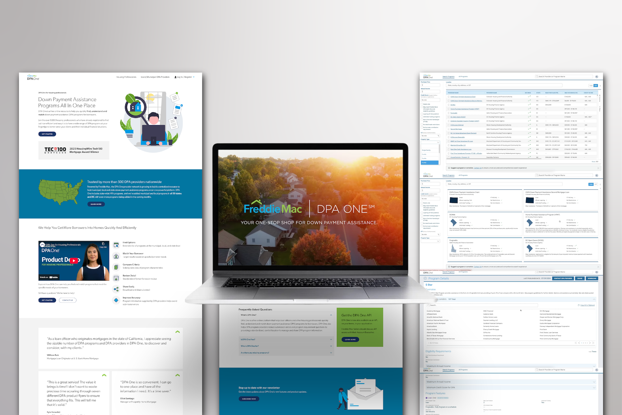
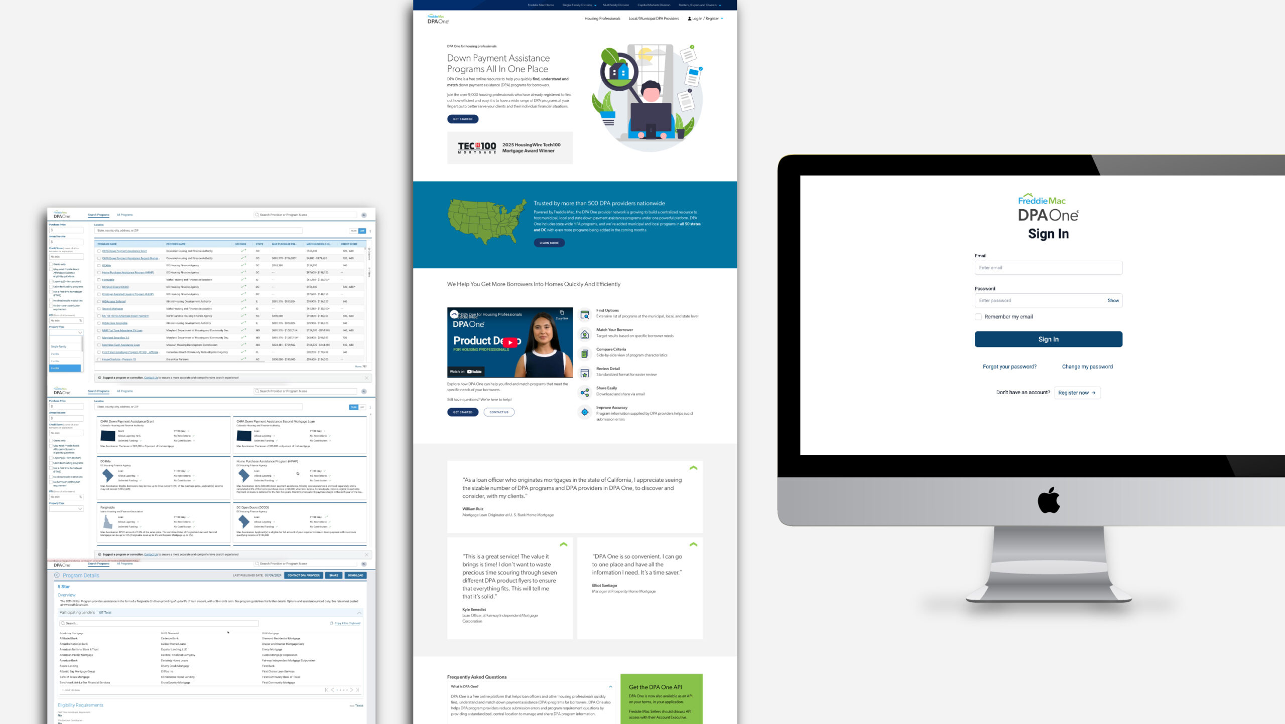
DPA One™ by Freddie Mac

Centralized down payment assistance platform.

DPA One™ is a centralized digital platform designed by RKS Design for Freddie Mac to simplify and democratize access to down payment assistance programs. Built with underserved communities in mind, the tool empowers housing finance agencies and lenders to streamline program management and connect more borrowers to sustainable homeownership.

Reimagining Homeownership Access Through Human-Centered Innovation

A composite image showing three screens: a software dashboard with data tables, a website with a cartoon of a woman and informational sections, and an iMac displaying a sign-in page for a platform called DPA One.
RKS Design began with a multi-week design sprint that integrated research and collaboration from day one. Through in-depth interviews with stakeholders—including state and local housing authorities, loan officers, and Freddie Mac leaders—we uncovered key pain points, workflow challenges, and emotional barriers to adoption. Applying our Psycho-Aesthetics® methodology, we transformed these insights into personas, user journeys, and experience goals that directly shaped the sprint-based prototyping process and the foundational UX strategy for DPA One.

Research & Ethnography

KEY OUTPUTS

6 Design Sprints-6 Weeks
Psycho-Aesthetics®
10+ Stakeholder Interviews
Dashboard Structure
Content Hierarchy
How We Used Psycho-Aesthetics® to Uncover Adoption Drivers in the Experience
Using our proprietary Psycho-Aesthetics® methodology, we facilitated collaborative design sprints with Freddie Mac and housing professionals to identify both functional and emotional barriers to adoption. Through structured interviews and persona mapping, we uncovered key themes—such as lack of trust in outdated workflows, the anxiety of incorrect data submission, and the need for confidence in representing public-facing programs. These insights guided the platform’s UX architecture and interaction design, ensuring clarity, accountability, and a sense of control across all user types.
A 4x5 grid of presentation slides with charts, diagrams, site maps, navigation menus, process flows, user personas, and dashboards, mostly with white backgrounds and red, black, and orange highlights.
Although DPA One is a digital platform, we approached it the same way we would physical product design. Our goal was to create an interface that not only worked—but felt trustworthy, clear, and intuitive to users with widely varying levels of technical comfort. To do this, we began with holistic experience mapping rooted in real user journeys. We charted every interaction point across the lifecycle of a DPA program—from initial data entry to lender updates. These maps served as the blueprint for the platform’s architecture, informing everything from dashboard layout and data validation flows to contextual alerts and navigation logic.

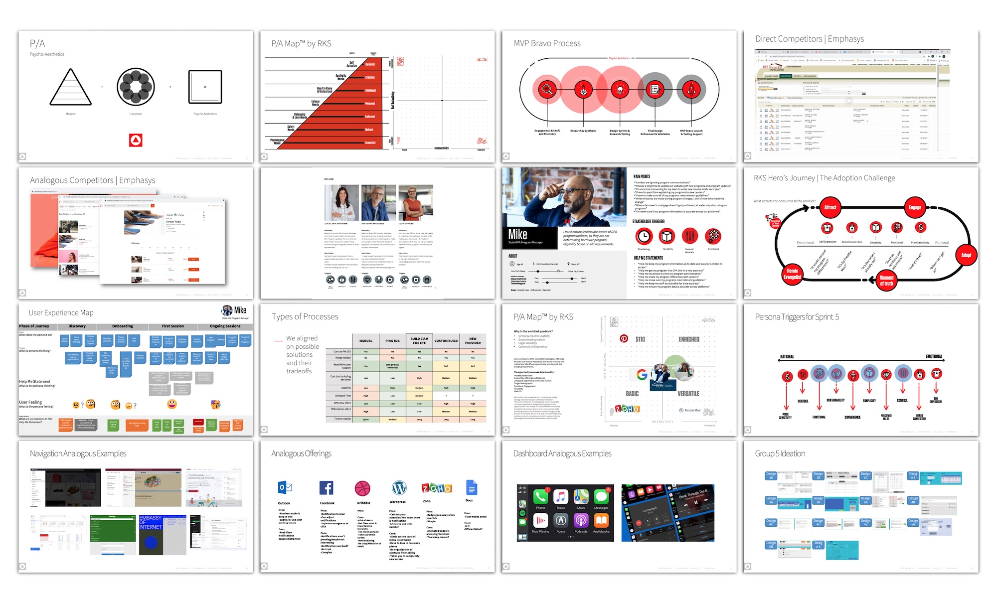
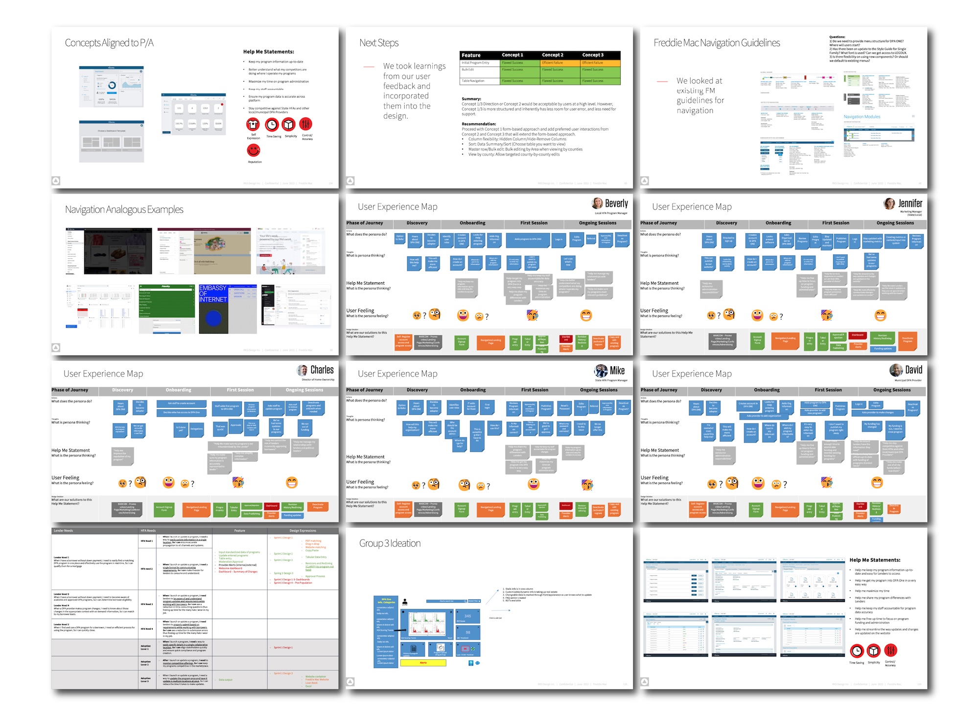
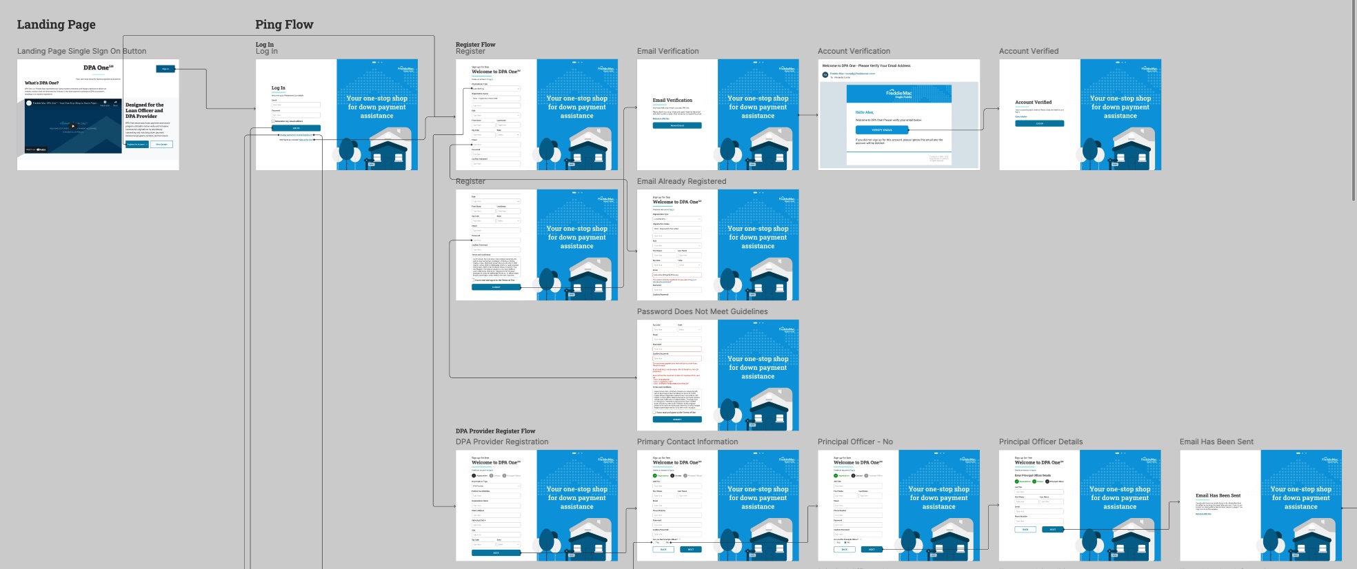
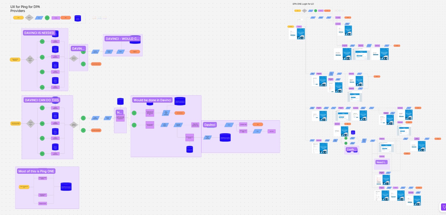
Design & Experience Mapping

KEY OUTPUTS

User Journey
Experience Maps
Navigation Wireframes
Dashboard, Redlining, and Approval Flows
Branded UI Design
A grid of twelve presentation slides showing user experience maps, navigation guidelines, concept diagrams, and screenshots; most slides feature flowcharts, diagrams, text, and website interface examples.
Over the course of six design sprints, we translated our research insights into a robust, intuitive, and emotionally resonant user interface. Our UX strategy was rooted in clearly defined user roles—DPA providers, lenders, and internal admins—each with distinct needs, workflows, and technical comfort levels. We crafted experiences that simplified dense data tasks, reduced errors, and made every interaction feel purposeful and human-centered. Features like tabular data entry, revision tracking, and drag-and-drop document uploads were designed not just for efficiency, but to instill confidence in users managing critical housing programs. Frequent usability testing with real stakeholders helped us refine flows and validate design decisions in real-time, ensuring the final interface struck a balance between simplicity, flexibility, and precision.

UI/UX Design

KEY OUTPUTS

Role-Specific User Flows
Tabula Data Interface
Alerts & Notifications
Figma Prototypes
User Testing
A flowchart showing the steps of a user ping process, starting from a landing page and including registration, email verification, password reset, and account verification screens with blue and white graphics of houses.
A digital project management board with color-coded sticky notes and cards arranged in columns and clusters, showing tasks and workflows labeled “DAVID IS READING,” “DAVID – WOULD LIKE,” and other project phases.

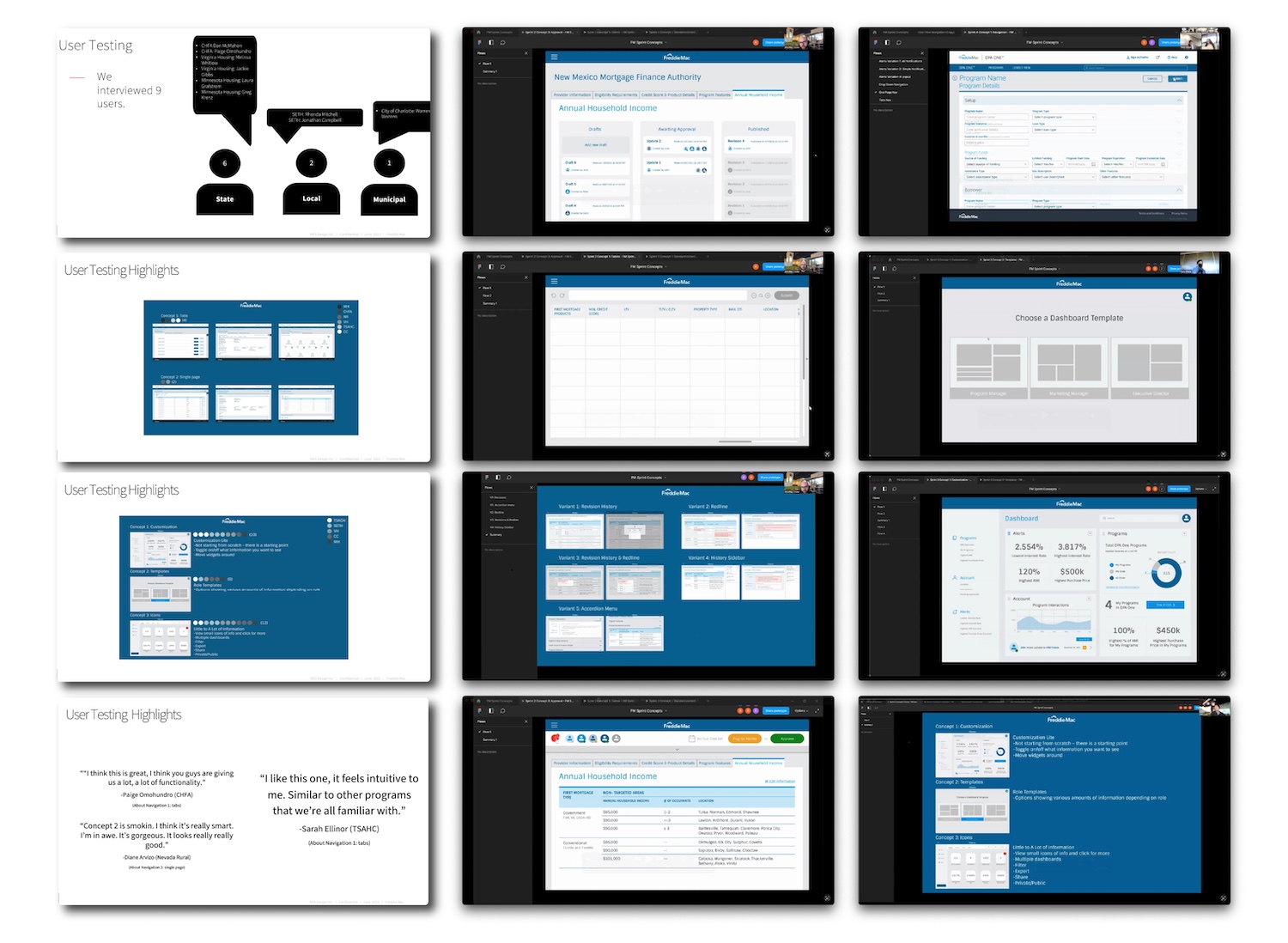
User feedback was central to shaping DPA One. Throughout development, we conducted structured testing sessions with housing professionals from across the country—including state HFAs, municipal program managers, and nonprofit partners in Texas, Virginia, and Minnesota. Each participant interacted with early prototypes, completing tasks and offering feedback on usability, clarity, and alignment with their day-to-day responsibilities. We tested three distinct design concepts across multiple user personas to identify the most intuitive, error-resistant experience. From there, we refined key workflows—like program entry, approval, and dashboard navigation—based on what real users found easiest and most trustworthy. 

User Testing & Validation

KEY OUTPUTS

3 Design Concepts
6 Agencies
Entry Flow Refinement
Dashboard Validation
A grid of twelve slides shows a user testing presentation, including diagrams, feedback highlights, and screenshots of a software interface with navigation bars, tables, forms, and dashboard summary views.

product status

DPA One™ is launched and live, actively used by over 9,000 professionals and more than 500 housing organizations across the United States. It’s the first digital platform of its kind to consolidate more than 400 down payment assistance programs into one centralized system, helping democratize access to homeownership nationwide.

real-world impact

DPA One is transforming how the housing ecosystem operates. By eliminating the fragmentation and confusion that once defined down payment assistance, it reduces program entry time by over 50%, increases the accuracy of program submissions, and simplifies compliance for lenders and housing providers alike. More importantly, the platform is closing gaps in access—supporting low- to moderate-income families and underserved communities in building generational wealth through homeownership. It has become a mission-driven product with measurable social and economic value.

Outcome & Results

Accomplishments

9,000+ Professionals Onboarded
500+ Housing Organizations
400+ Programs Aggregated
50%+ Time Savings
Equitable Homeownership
A laptop displays the Freddie Mac DPA One homepage, surrounded by printed webpages and software interface screenshots, illustrating payment assistance program resources and digital application tools.

ready to partner with us?

You have signed up for the designer!

Welcome to a world of design and innovation

Your download has started!

If this is not the case, then click the button below to start it