Coors Light Packaging

Premium Coors Light packaging innovation.

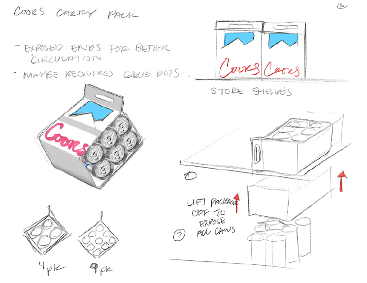
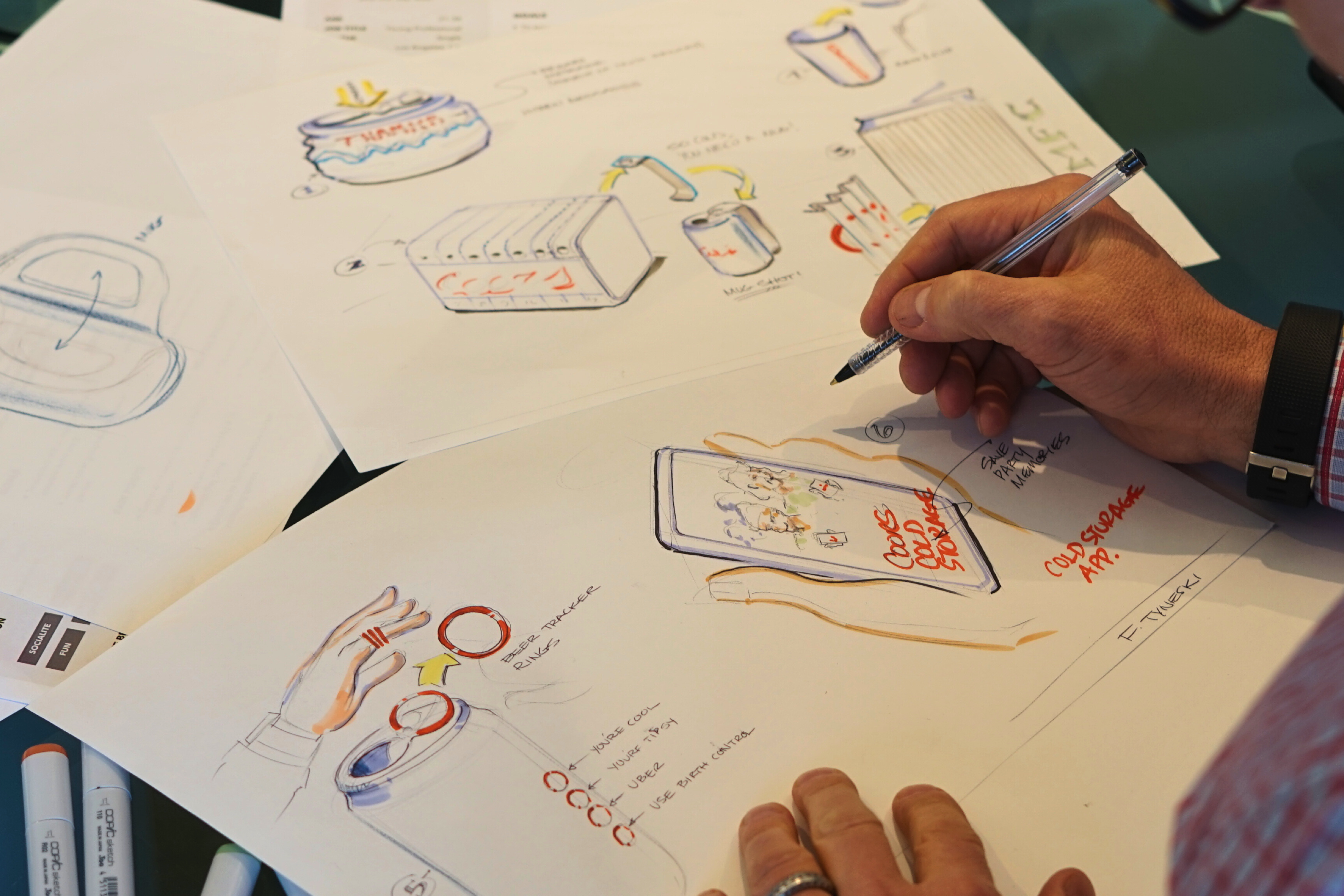
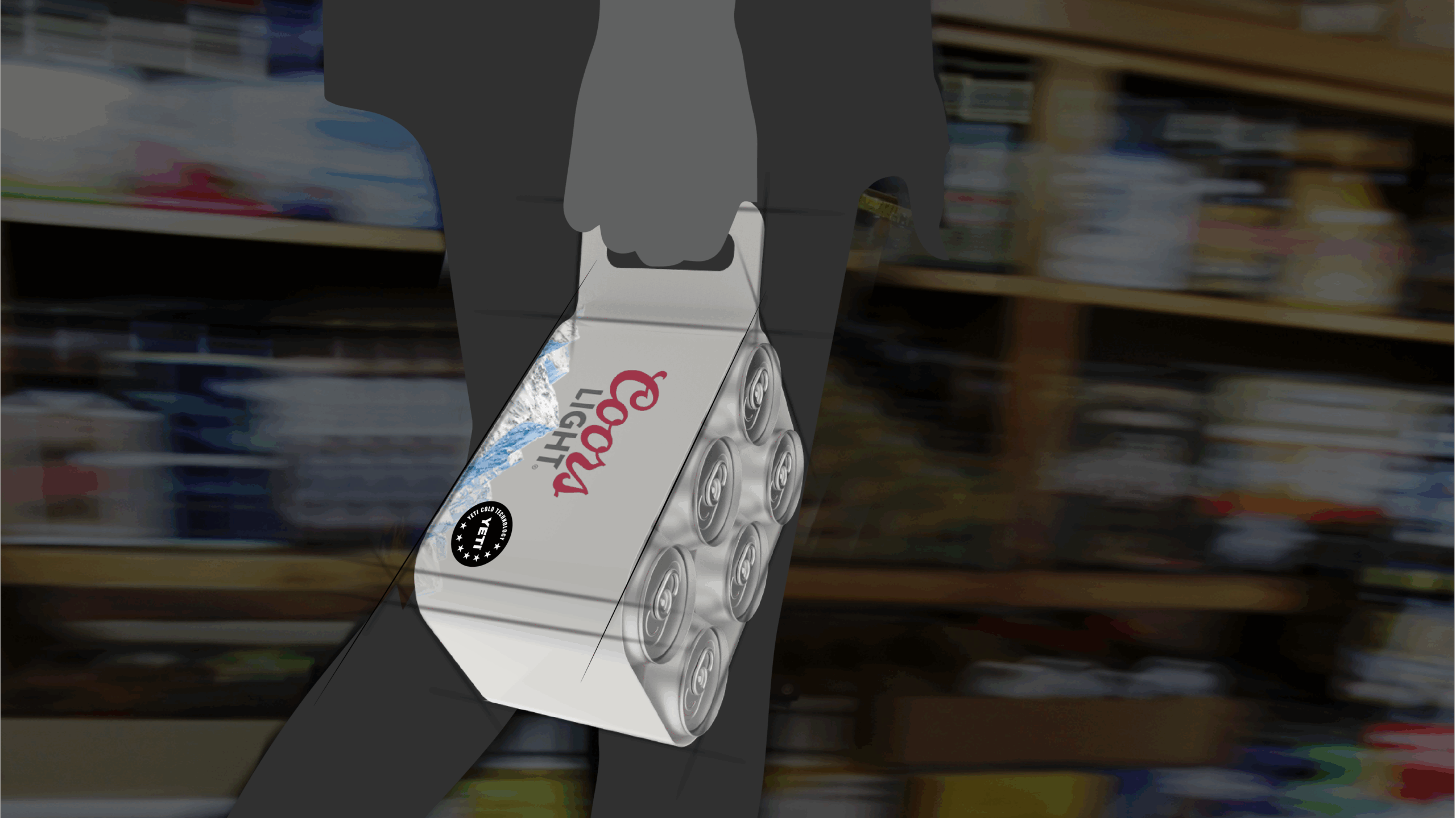
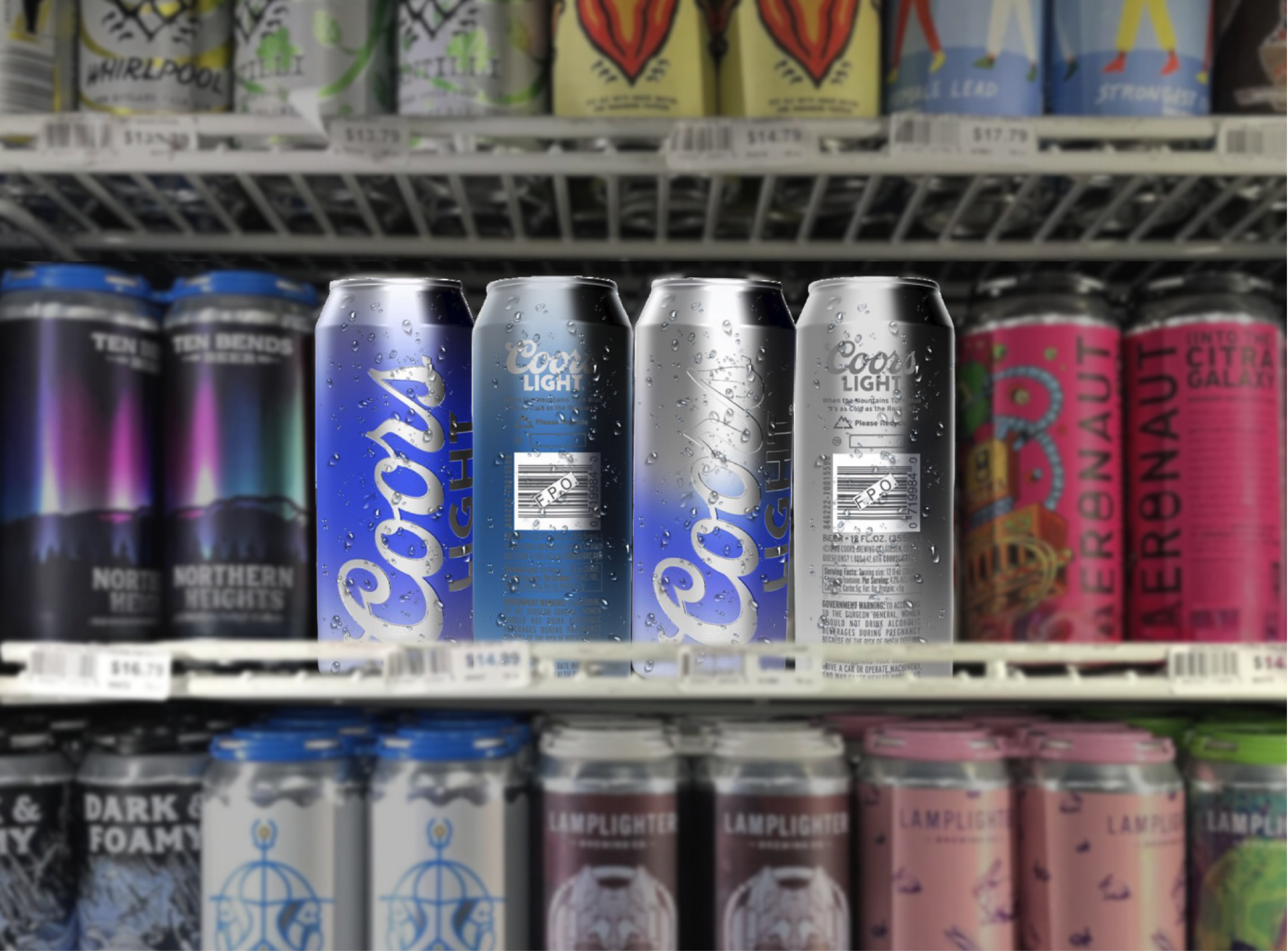
Facing declining engagement amid the rise of craft beer, Coors Light needed to reinvigorate its shelf presence and emotional appeal—especially among younger, authenticity-seeking consumers. RKS Design partnered to create packaging that communicates cold, portability, durability, and cultural relevance in a competitive landscape.

Reinventing refreshment for a new generation

A set of Coors Light cans transitioning from silver to blue, demonstrating thermochromic technology.
RKS applied its human-centered methodology to understand emotional and functional motivations behind beer purchase decisions. Through home visits, party observations, and in-store shop-alongs, the team surfaced key insights—concerns like coldness retention, ease of transport, and authenticity-driven brand preference. Younger consumers associated these with smaller craft breweries due to their storytelling and visual identity—highlighting an opportunity for Coors Light.

Research Insights & Discovery

KEY OUTPUTS

User Personas
Psycho-Aesthetics® 2.0 Map
Benchmarking
Opportunity Areas & Design Criteria

How We Used Psycho-Aesthetics™ to Identify Unique Opportunities in the Project.

Using our proprietary Psycho-Aesthetics® 2.0 framework, we conducted in-depth interviews and ethnographic observation in diverse lab settings. We identified key emotional and usability pain points — such as intimidation with complex interfaces, workspace clutter, and trust in precision. These insights guided both the form and interface strategy, ensuring approachability and confidence in operation.

A brand positioning chart mapping Coors Light against competitors based on interactivity and self-actualization.
A collage of research insights, consumer personas, and packaging design concepts.
RKS explored versatile concepts—from thermochromic cans that turn blue when cold to structural packaging that supports portability and shelf visibility. Co-branding mock-ups (e.g., YETI cooler collaboration) and carry‑case enhancements were explored, all grounded in reinforcing brand identity and utility.

Packaging Design

KEY OUTPUTS

Thermo-ink can
Packaging structures optimized for carryability and visual theatre
Concept iterations balancing novelty with shelf pragmatics
A detailed sketch of an innovative Coors Light can opening mechanism with a rotating lid.
A designer sketching packaging concepts, including beer storage, tracking rings, and a cold storage app.
The design refresh aimed to keep Coors Light’s authentic mountain heritage while introducing modern visual storytelling and freshness. This included refined graphic languages, cohesive iconography, and subtle heritage cues that resonate emotionally.

Branding Design

KEY OUTPUTS

Visual identity
Package storytelling elements
Refined secondary packaging to support brand story
Coors Light cans displayed alongside craft beers in a retail setting.
RKS Design’s strategic packaging redesign for Coors Light blends emotional insight with visual innovation—helping one of America’s iconic beers resist craft beer’s pull through subtle but powerful packaging cues. The project demonstrates RKS’s strength in leveraging brand heritage, sensory storytelling, and behavioral insight to reshape mainstream brand relevance.

Key Outcomes and Results

Key Accomplishments

Strengthened narrative positioning
Repositioned heritage brand to engage experience-seeking younger consumers
Ready for pilot testing in future campaigns
A cold-activated Coors Light can turning blue, standing apart from a row of standard silver cans.

ready to partner with us?

You have signed up for the designer!

Welcome to a world of design and innovation

Your download has started!

If this is not the case, then click the button below to start it