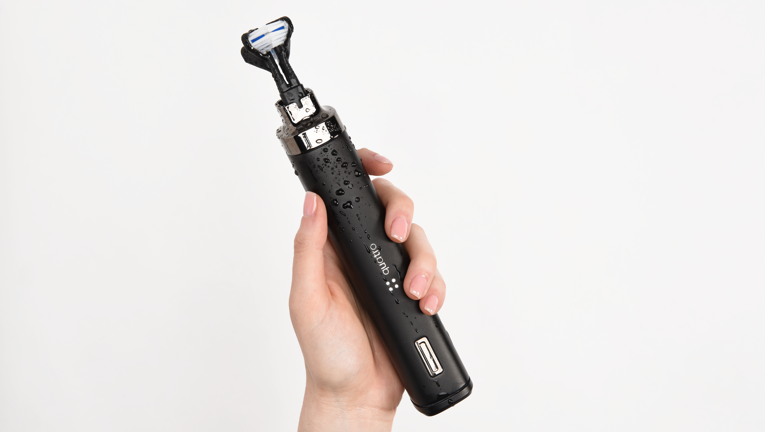
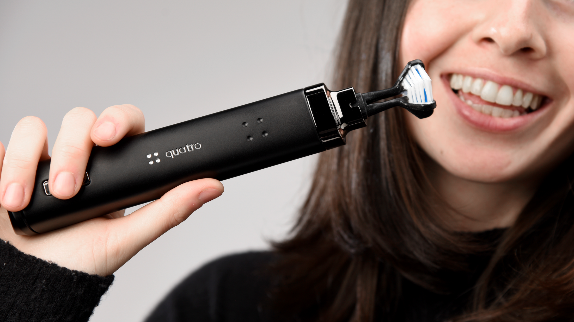
Quatro Toothbrush
Next-gen four sided toothbrush system.
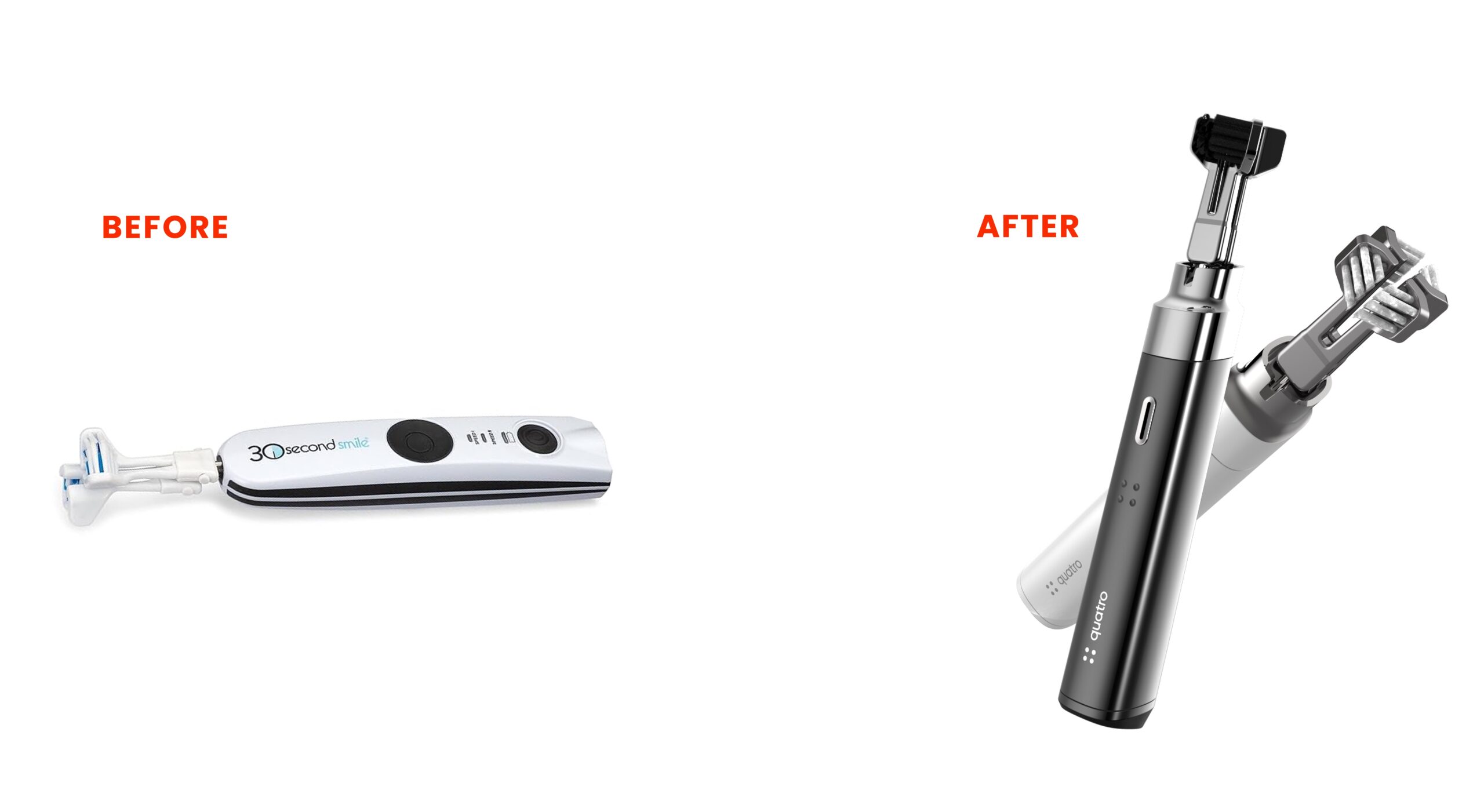
Toothbrushes rely on manual technique, prone to user error, inconsistent results, and long brushing times. QuatroBrush addresses these issues by automating multi surface cleaning, minimizing human variability, and elevating the hygiene experience.
Revolutionizing brushing for excellence in oral care.
Utilizing field studies and consumer interviews, RKS investigated brushing habits and pain points, time constraints, inconsistent cleaning, and user fatigue. Our Psycho‑Aesthetics® approach revealed the emotional drivers of cleanliness, confidence, and aesthetics.
Research Insights & Discovery
KEY OUTPUTS
How We Used Psycho-Aesthetics™ to Identify Unique Opportunities in the Project.
Using our proprietary Psycho-Aesthetics® 2.0 framework, we conducted in-depth interviews and ethnographic observation in diverse lab settings. We identified key emotional and usability pain points — such as intimidation with complex interfaces, workspace clutter, and trust in precision. These insights guided both the form and interface strategy, ensuring approachability and confidence in operation.

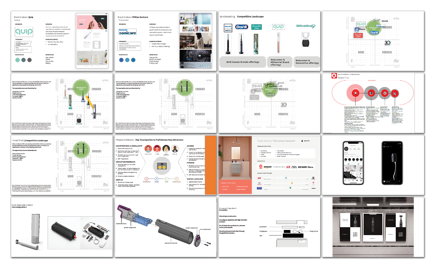
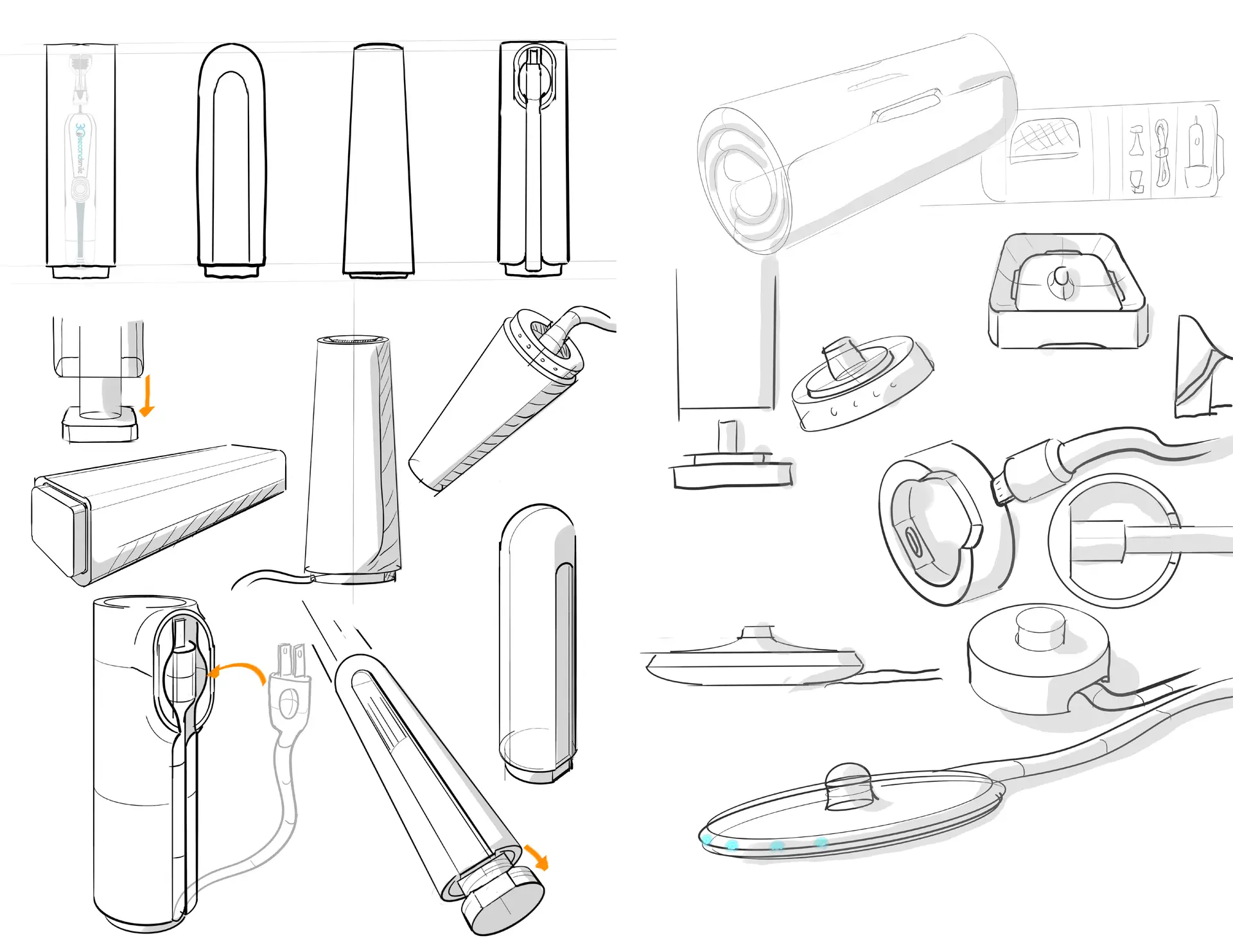
Industrial Design Concept Development
KEY OUTPUTS
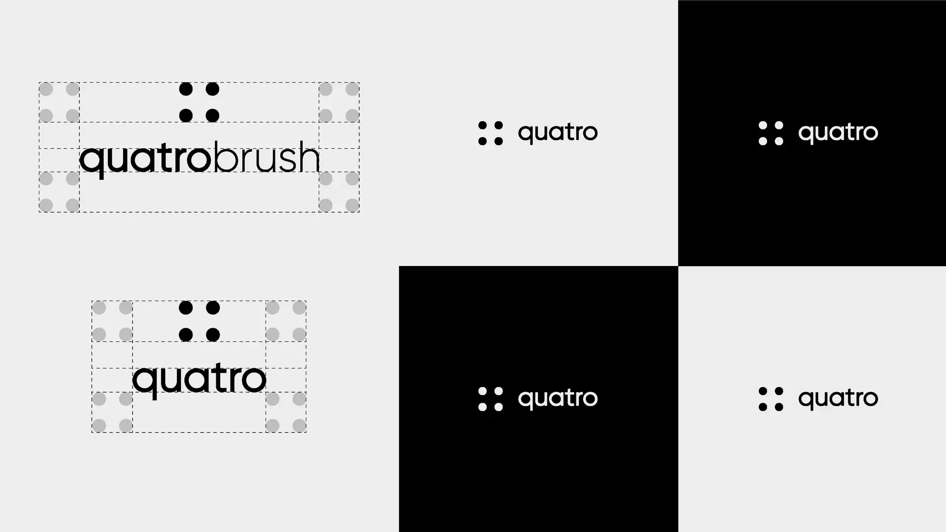
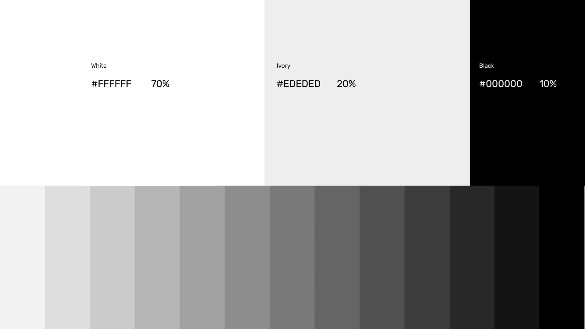
Brand Strategy
KEY OUTPUTS
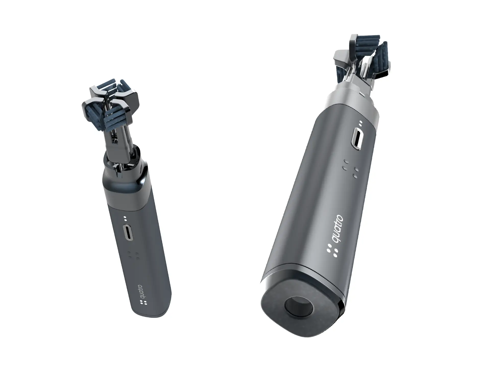
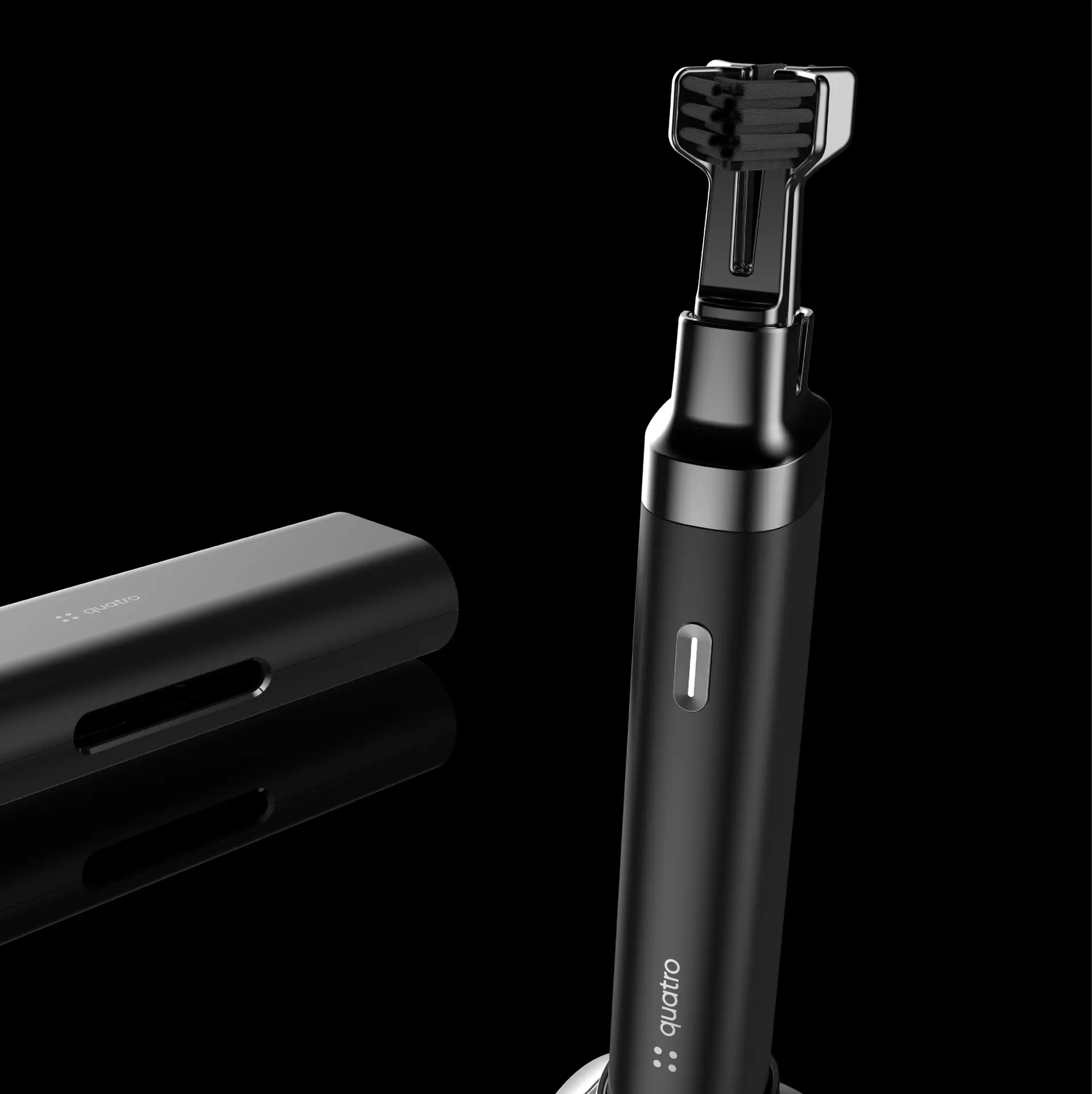
Working in partnership with dental hygiene experts, engineers refined internal brushing mechanics, motor control, and battery performance to ensure consistent four sided coverage across various tooth geometries.
Product Engineering & Development
KEY OUTPUTS
Compliance ready engineering supporting
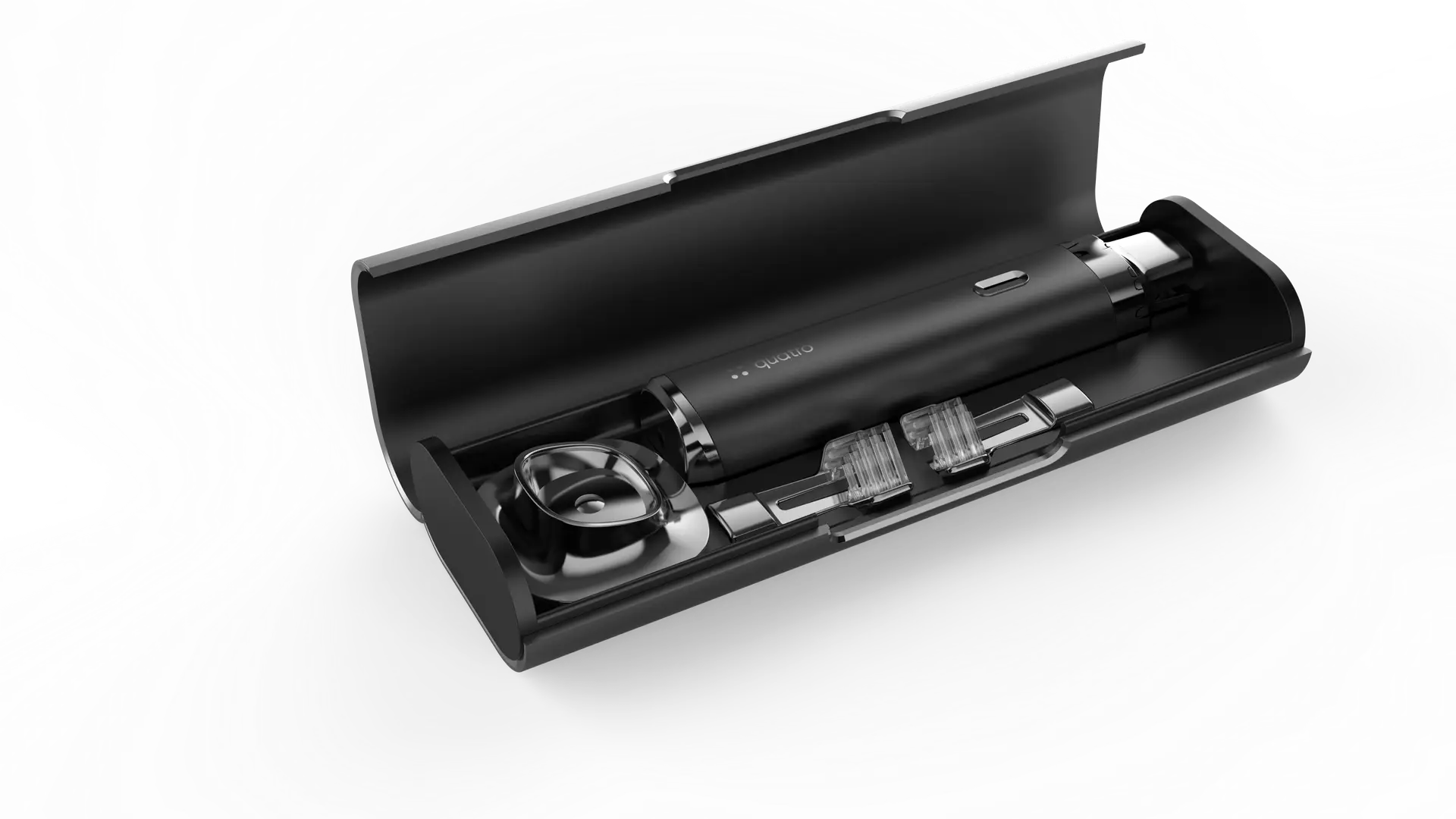
RKS executed multiple prototype cycles, from appearance models to high performance user tested units. Manufacturing support included tooling specifications, material selection guidance, and quality assurance processes.
Prototyping & Manufacturing Support
KEY OUTPUTS
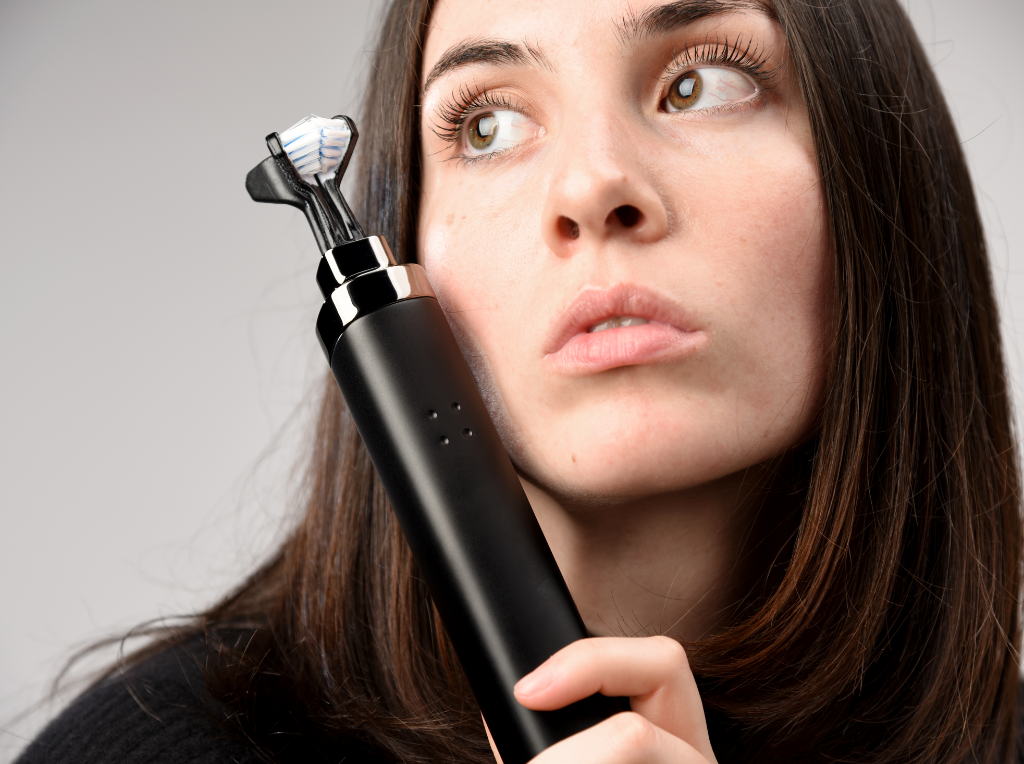
High fidelity prototypes for usability and packaging validation
User testing insights on brushing comfort and interface feedback
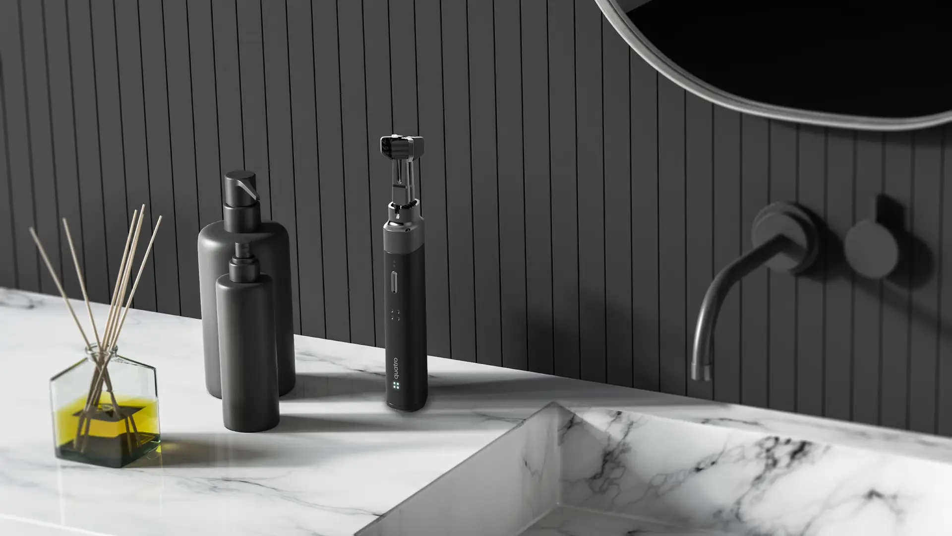
QuatroBrush exemplifies RKS Design’s prowess in uniting functional innovation with emotional design. The product’s research led strategy, ergonomic form, intuitive interface, and cohesive brand identity transformed routine brushing into an efficient, polished, and confidence building experience, demonstrating compelling design that bridges human need and market aspiration.
Real World Results & Impact
Key Accomplishments