
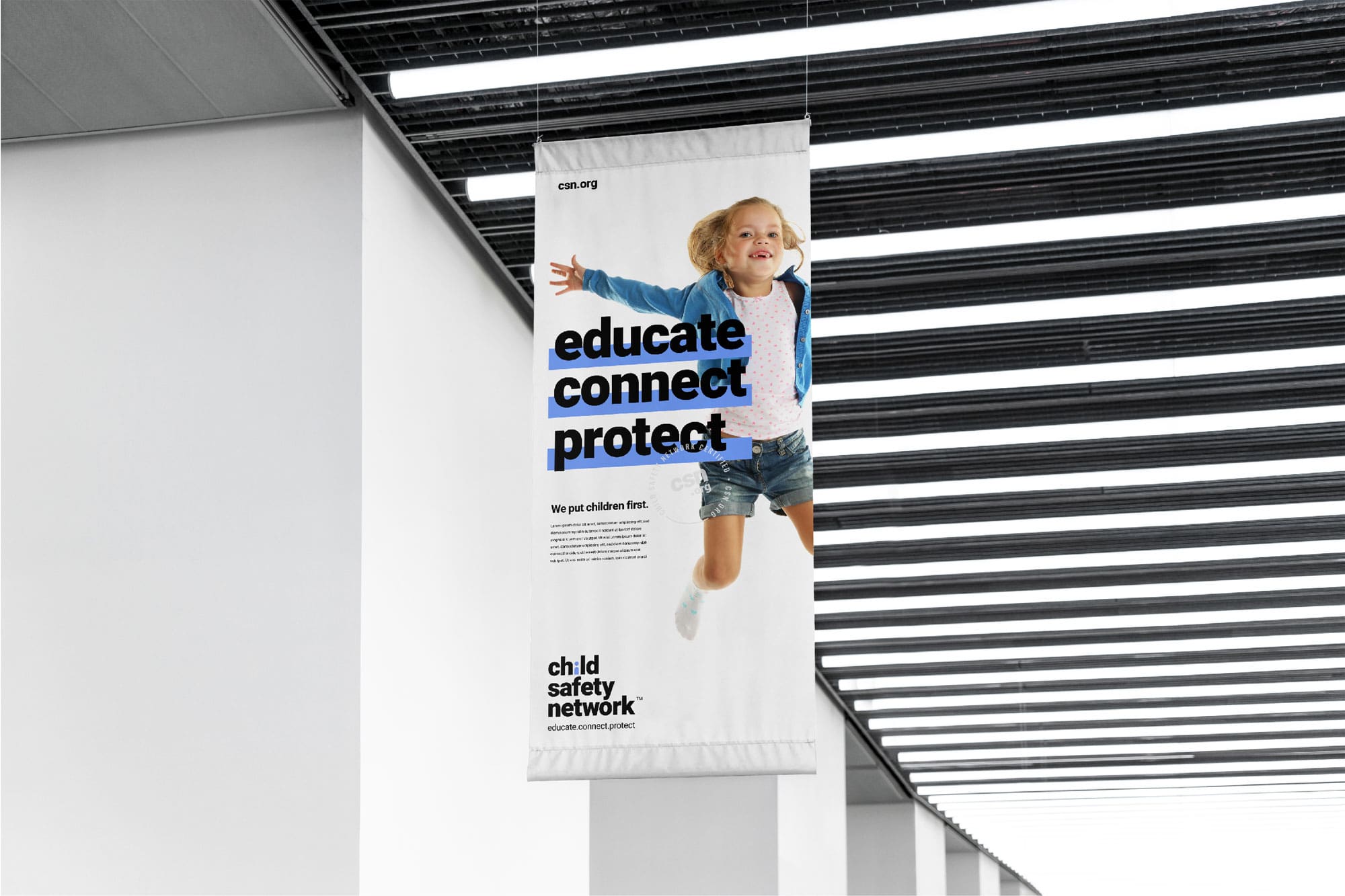
Educate, Connect, Protect.
Celebrating 30 years of defending children’s safety, Child Safety Network (CSN) needed a refreshed identity that resonated with modern, digitally savvy parents and supported fundraising engagement. The goal: evolve to an emotionally empowering voice, shifting from fear based warnings to community-focused, proactive messaging.
“The team at RKS was amazing, innovative, spot on and truly at the top of their game! The work they performed will help us make the world a safer place for children to live.”
Founder of Child Safety Network
Brand Strategy & Emotional Positioning
Key Outputs
- Psycho‑Aesthetics® emotional quadrant mapping
- Persona based narratives for millennial parents and educators
- New mission statement and messaging framework
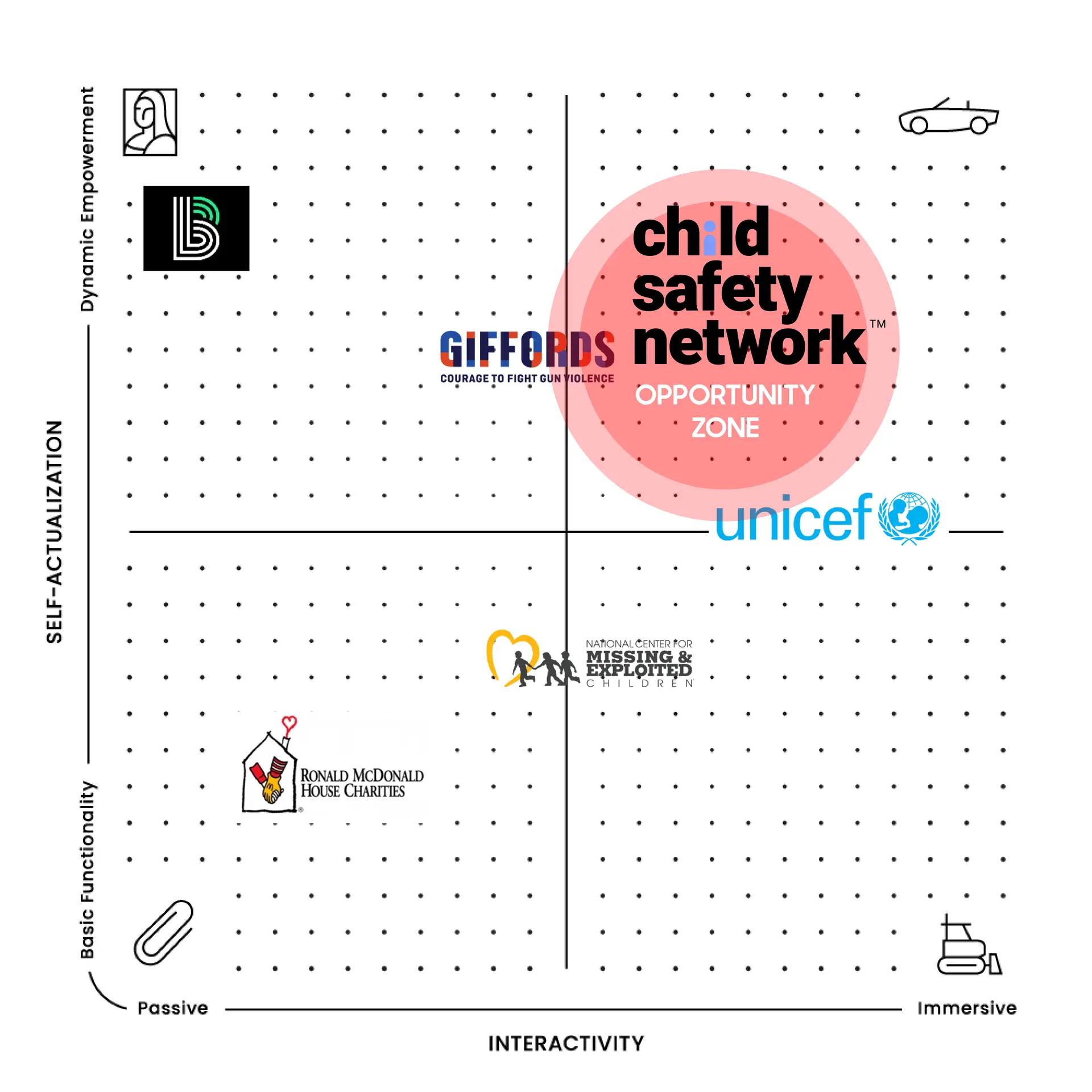
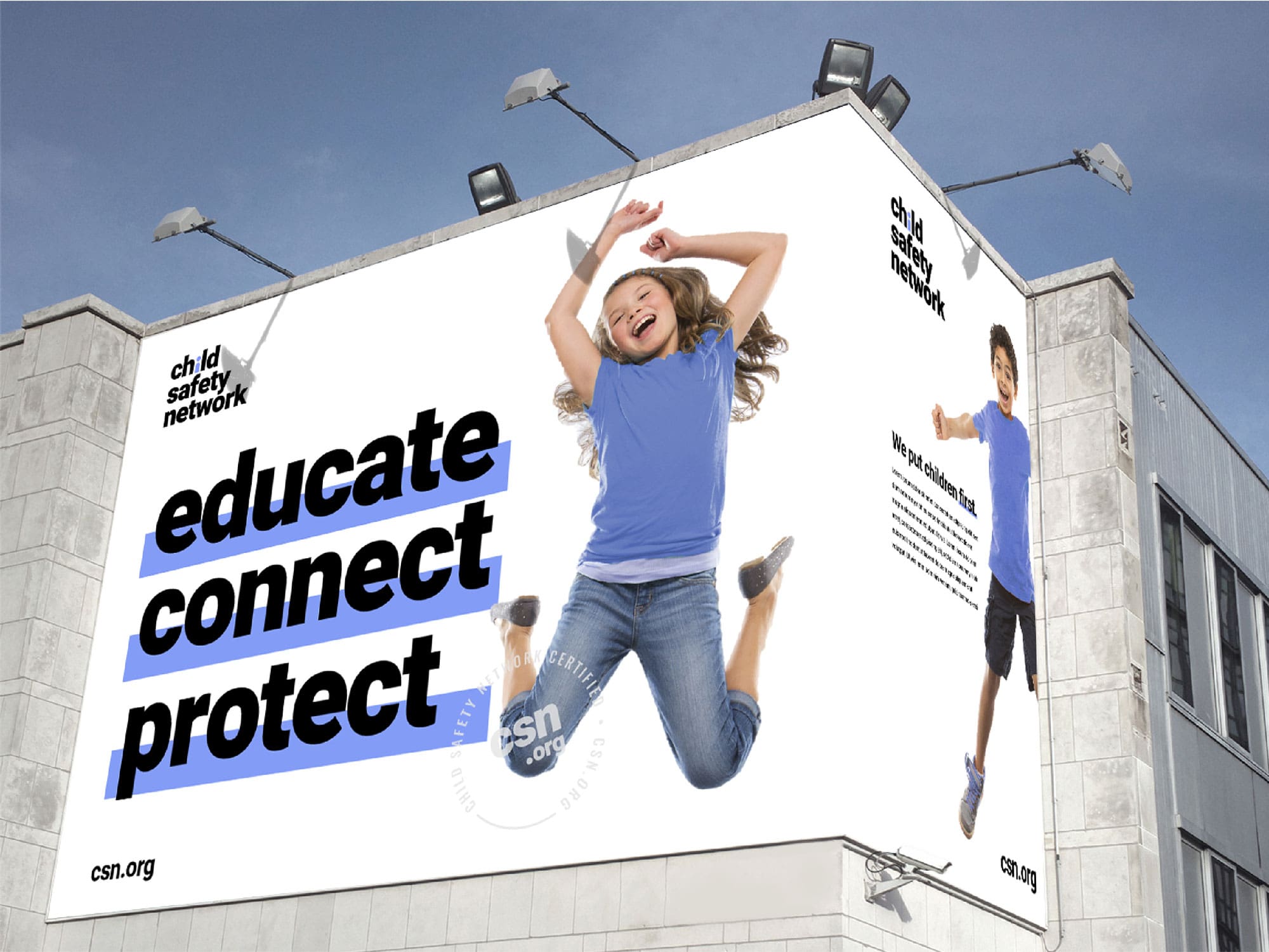
RKS engaged CSN in strategic brand workshops, employing Psycho‑Aesthetics® to map emotional needs and reposition the nonprofit within the “enriched” quadrant, emphasizing empowerment, optimism, and legacy. A new three word mission statement, “Educate, Connect, Protect,” emerged to drive purpose and fundraising clarity.
How We Used Psycho-Aesthetics™ to Identify Unique Opportunities in the Project.
Using our proprietary Psycho-Aesthetics® 2.0 framework, we conducted in-depth interviews and ethnographic observation in diverse lab settings. We identified key emotional and usability pain points, such as intimidation with complex interfaces, workspace clutter, and trust in precision. These insights guided both the form and interface strategy, ensuring approachability and confidence in operation.

Visual & Branding Redesign
Key Outputs
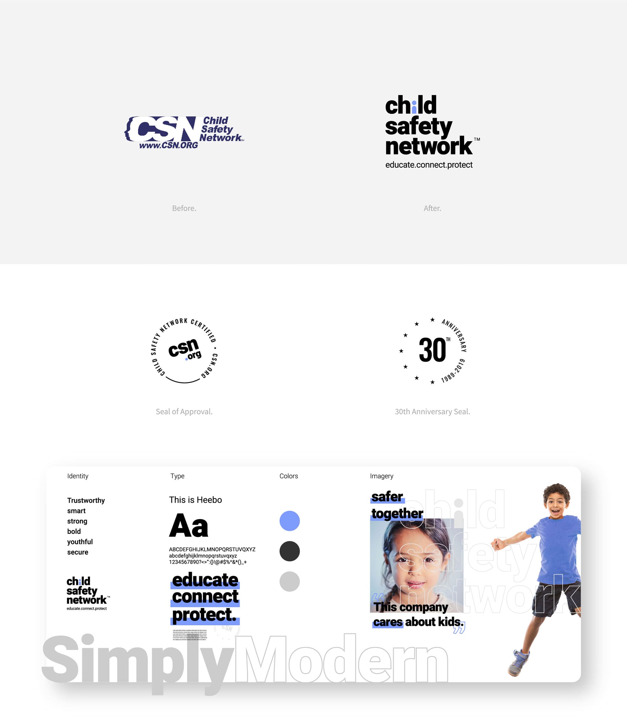
- Redesigned logo and visual identity system
- Brand color palette and typography guidelines
- Messaging suites for web, marketing materials, and pitch decks
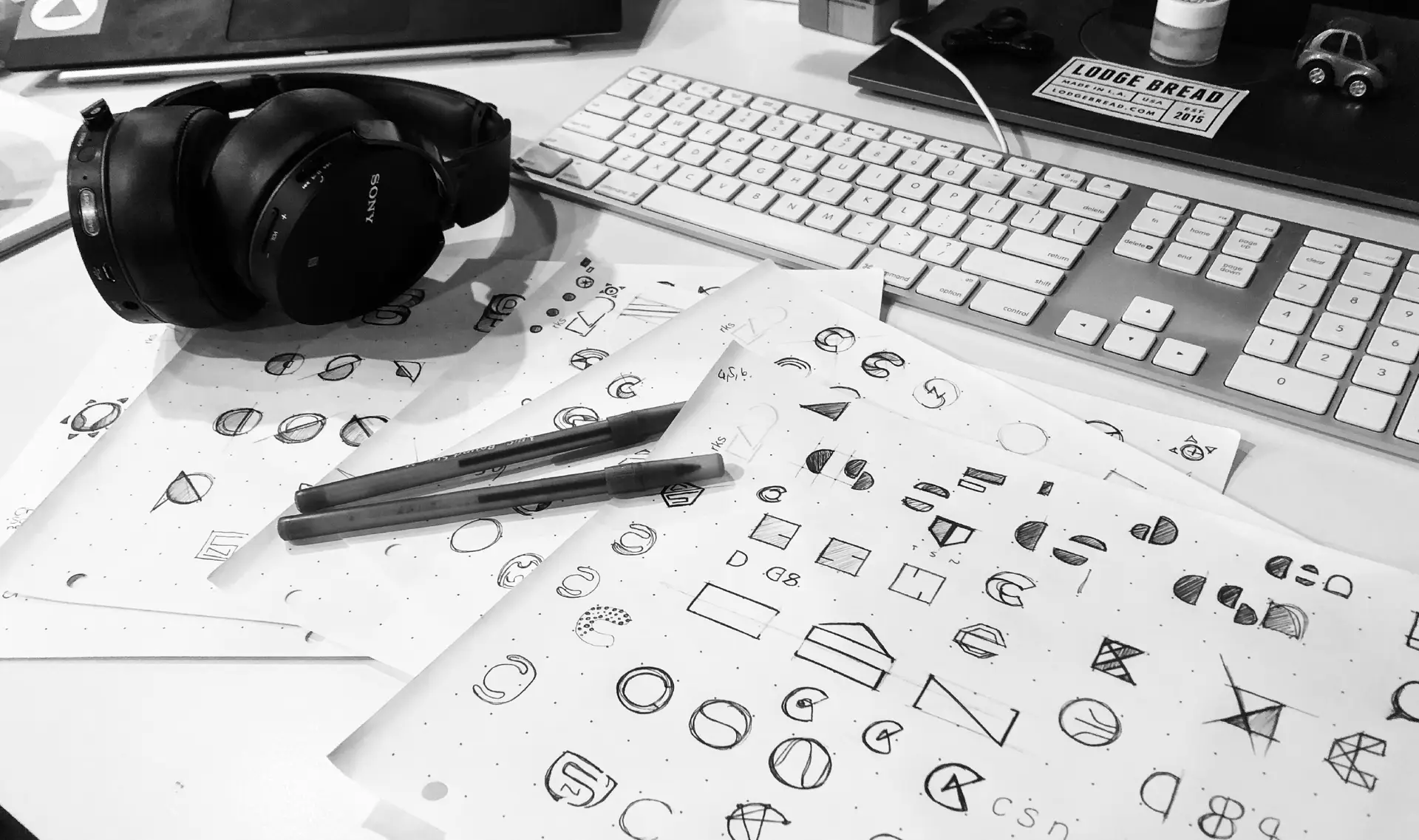
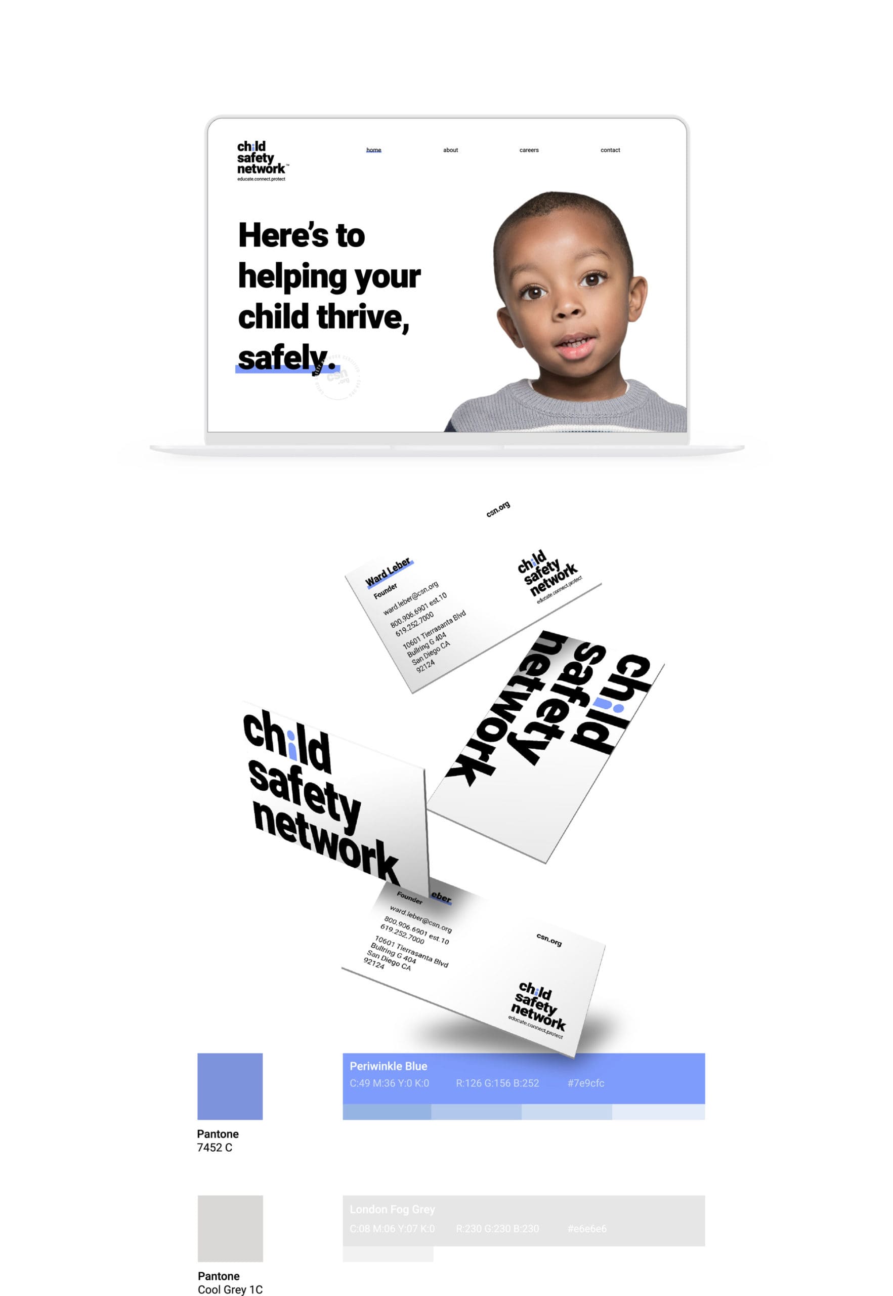
Together with CSN, we crafted a modernized visual identity with a new logo, refreshed graphics, and an approachable color palette. These updates maintain honor for CSN’s legacy while projecting relevance and trustworthiness. We transitioned the organization’s tone from fear driven to empowering, aligning messaging with hope and action.
Messaging, Fundraising & Partnerships Support
Key Outputs
- Core messaging copy decks and tagline systems
- Fundraising pitch narratives and presentation templates
- Collateral guidelines to unify communications and donor facing materials
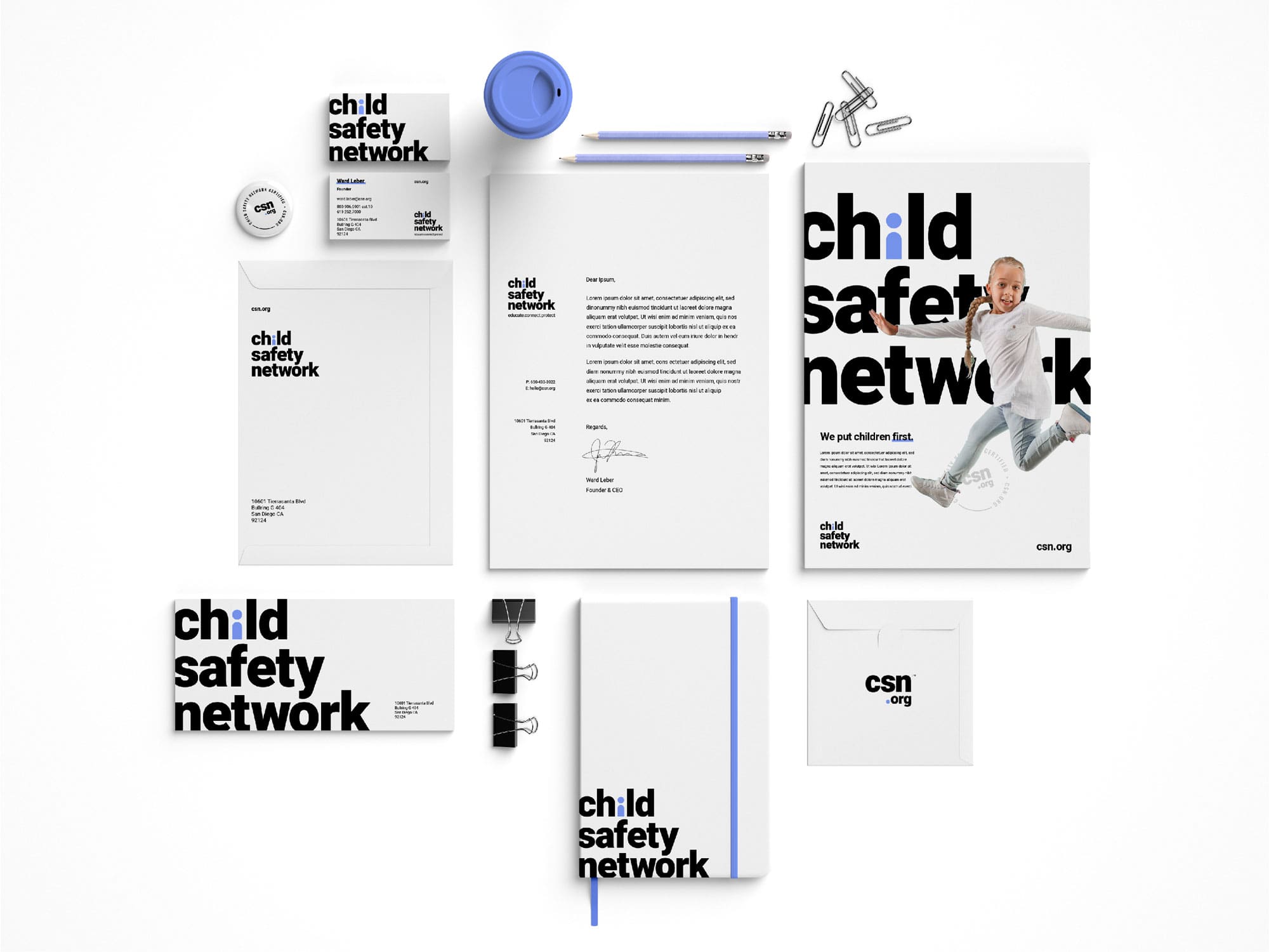
Recognizing the need for strong messaging to fuel partnerships and donor engagement, we positioned the updated brand storytelling to appeal to funders and grassroots audiences alike. The refreshed identity offers clarity, emotional resonance, and momentum across touchpoints.
Key Outcomes and Results
Key Outputs
- Status: Rebrand completed and rolled out across website, collateral, and pitch materials in 2019
- Impact:
- Elevated brand relevance for millennial parents and educators
- Redesigned identity reinforced CSN’s mission of “Educate, Connect, Protect”
- Positioned organization for increased fundraising engagement and strategic partnerships
This rebrand exemplifies RKS’s unique ability to merge emotional strategy with non profit mission driven storytelling. By leveraging human-centered insight and Psycho‑Aesthetics®, we helped CSN transition from fear-based messaging to proactive engagement, thus broadening appeal and facilitating meaningful community impact.
ready to partner with us?
Contact UsExplore More Work
Unilever
Sustainability and Global Strategy to drive and reduce water usage in the laundry category for emerging markets.
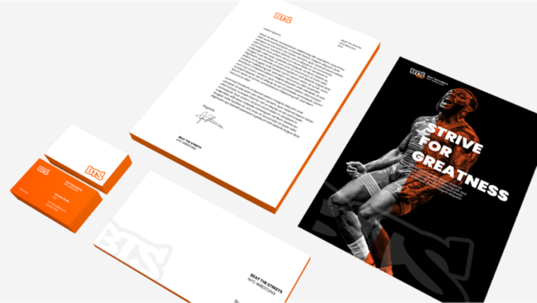
Beat the Streets
A compelling brand identity for non-profit youth wrestling organizations that inspires inner-city youth to participate while engaging donors to support their growth and development.
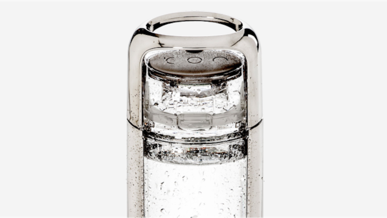
Kor One
Stylish personal hydration designed to eliminate disposable water bottles, paving the way for a sustainable and brighter future.
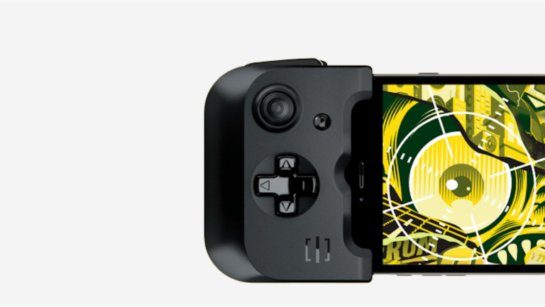
Gamevice
A new mobile gaming category that enables gamers to play on the go with physical controls and zero latency.
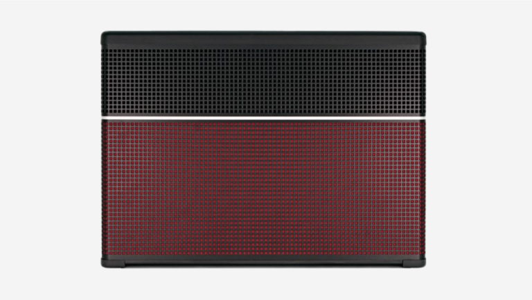
Line 6
A smart, high-performance guitar amp designed to amplify the unique sound of your favorite guitar.
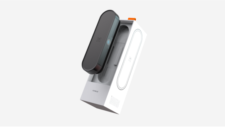
Xcinex Venue
Bringing the Big Screen to the comfort of your home.
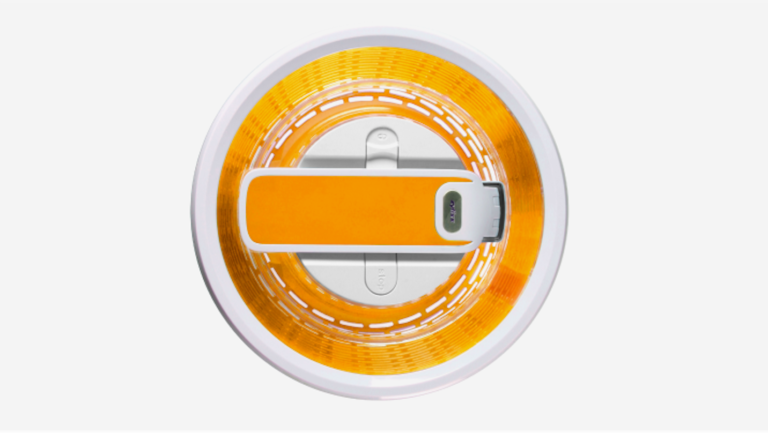
Zyliss
Creating iconic kitchen gadgets that rise above the rest.
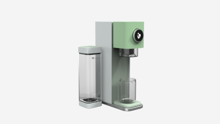
Baby Barista
The perfect baby bottle formula in less than a minute.
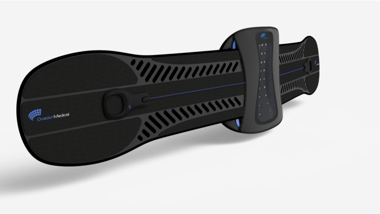
Ovation
Active influenced back brace that delivers support through a streamlined design.
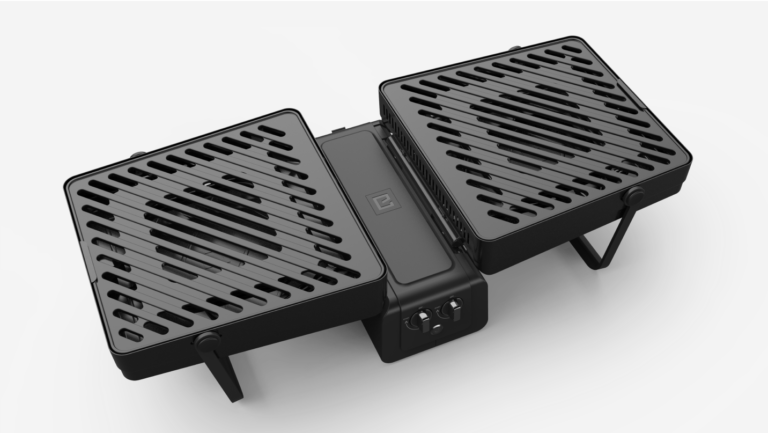
Elevate Grill
A compact, portable grilling experience.
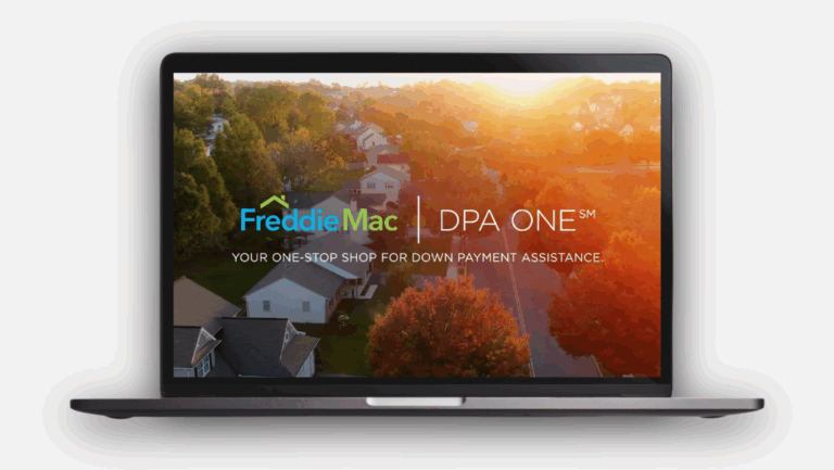
DPA ONE®
Reimagining homeownership access through human-centered innovation.
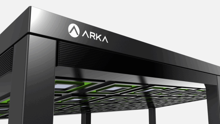
Arka Power Gazebo
Elegant solar powered outdoor living.