
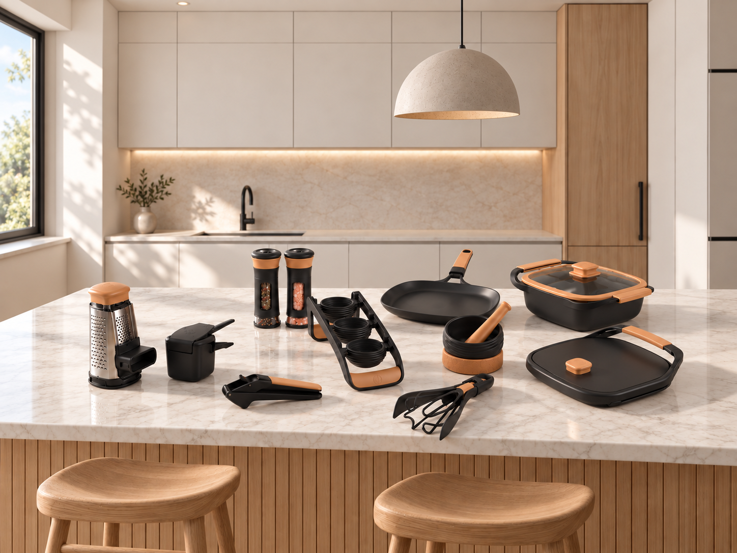
A brand built to make an unfamiliar dish feel worth trying.
RKS Design partnered with Kitalma to build a brand, a design language and a product family for cookware that carries a cuisine with it. The factory and the range were already in place; the point of view was not. Guided by the Psycho-Aesthetics® methodology, our innovation consulting team found the barrier was rarely skill and almost never equipment. It was confidence.

“Cookware with soul: a culinary passport for the home kitchen.”
The Kitalma Collection film, from the brand’s own channel. The range as it reached market: cookware, tools and serveware drawn to one design language, shown in the kitchens it was designed for.
Ethnographic Research
Key Outputs
- Ethnographic Field Research
- Category & Competitive Audit
- Persona & Behavior Mapping
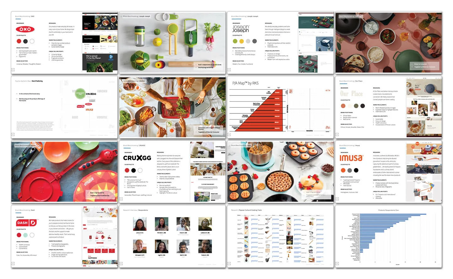
RKS began in kitchens rather than the studio. Through ethnographic research, including in-home observation and interviews, the team watched people cook dishes from cultures other than their own: what they reached for, where they improvised, where they quietly gave up.
A category audit, tool benchmarking and a demand survey ran alongside. The obstacle was rarely skill. It was confidence, and that set the brief.
How We Used Psycho-Aesthetics® to Identify Unique Opportunities in the Project.
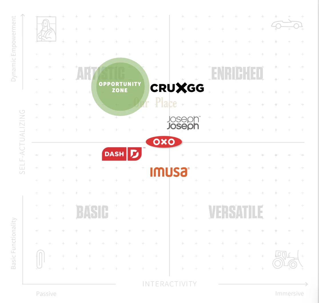
Using our proprietary Psycho-Aesthetics® framework, we mapped the cookware category against two axes: the consumer’s hierarchy of needs and desires, and their level of interactivity with the product. OXO, Dash and IMUSA sat low and center, where the promise is simply that the tool works; CRUXGG, Our Place and Joseph Joseph reached higher but stayed in the middle of the field.
The opportunity zone sat top-left, in the artful quadrant: high on aspiration, quiet in use. Cookware that carries a cuisine with it rather than merely cooking one. That zone became the brief.
Industrial Design
Key Outputs
- Form & Mass Exploration
- Silhouette Studies Across the Range
- Material & Colorway Direction
- Product Design Language
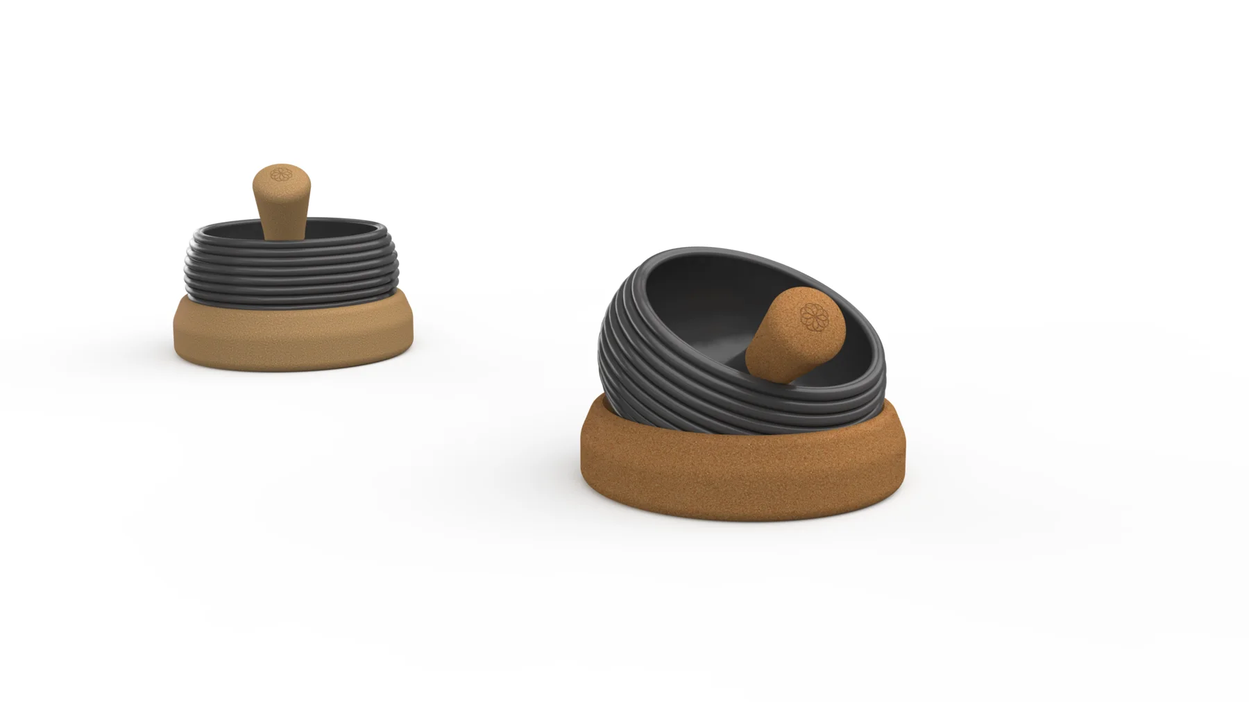
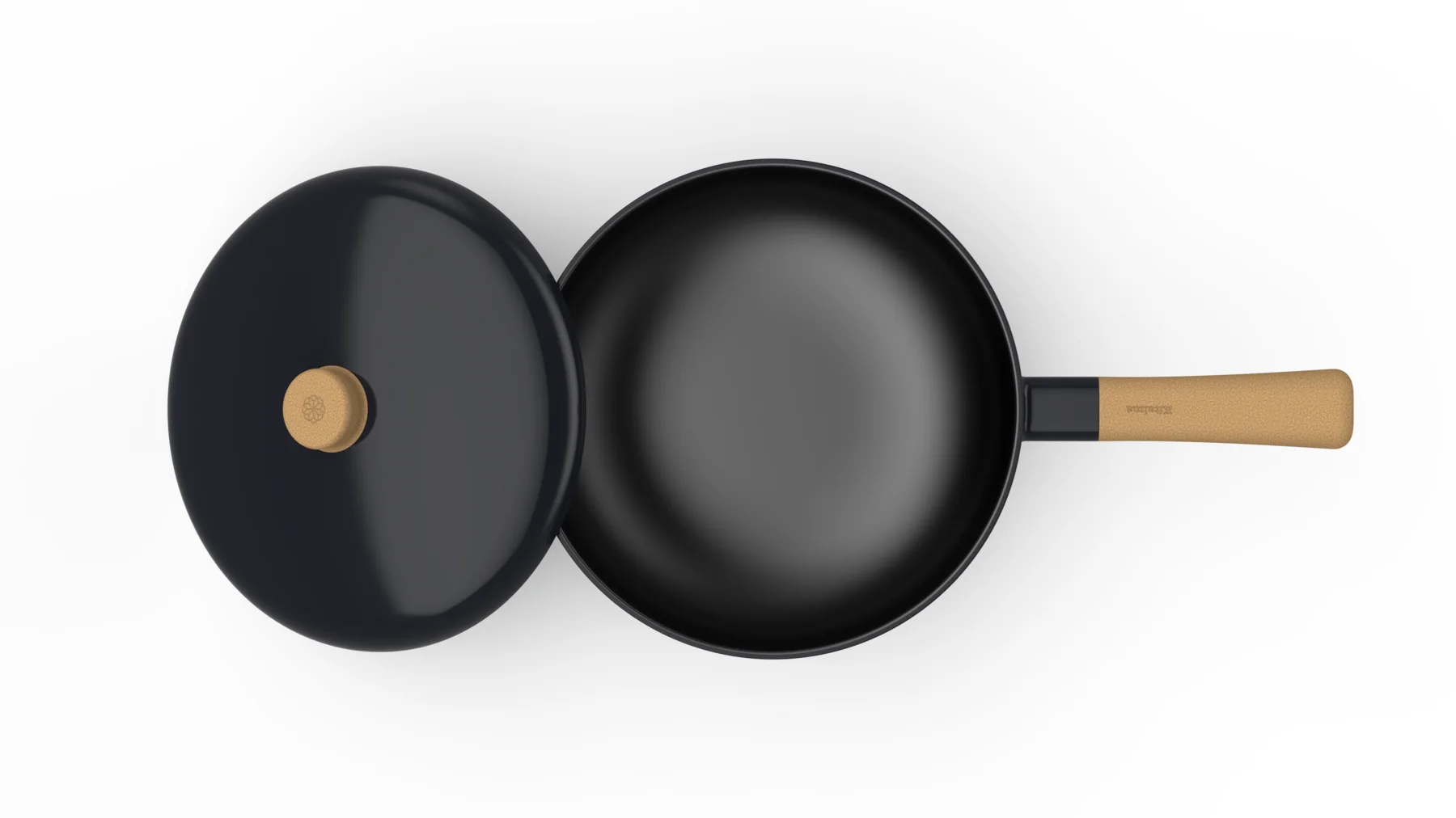
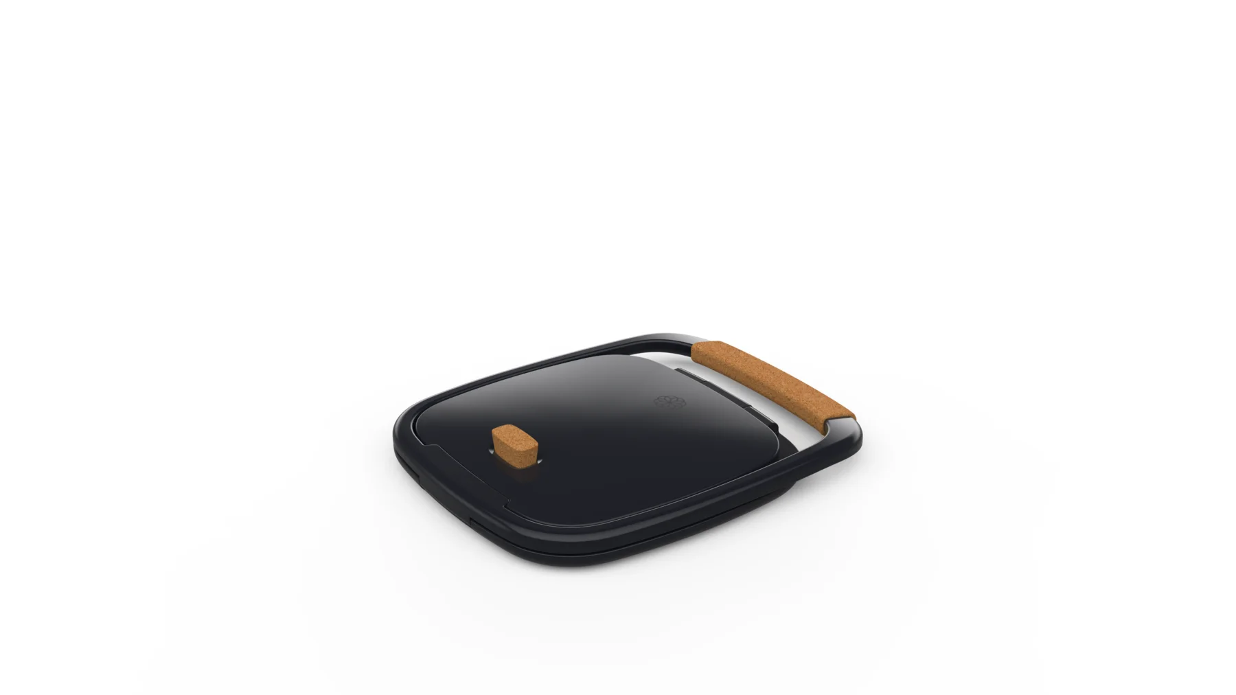
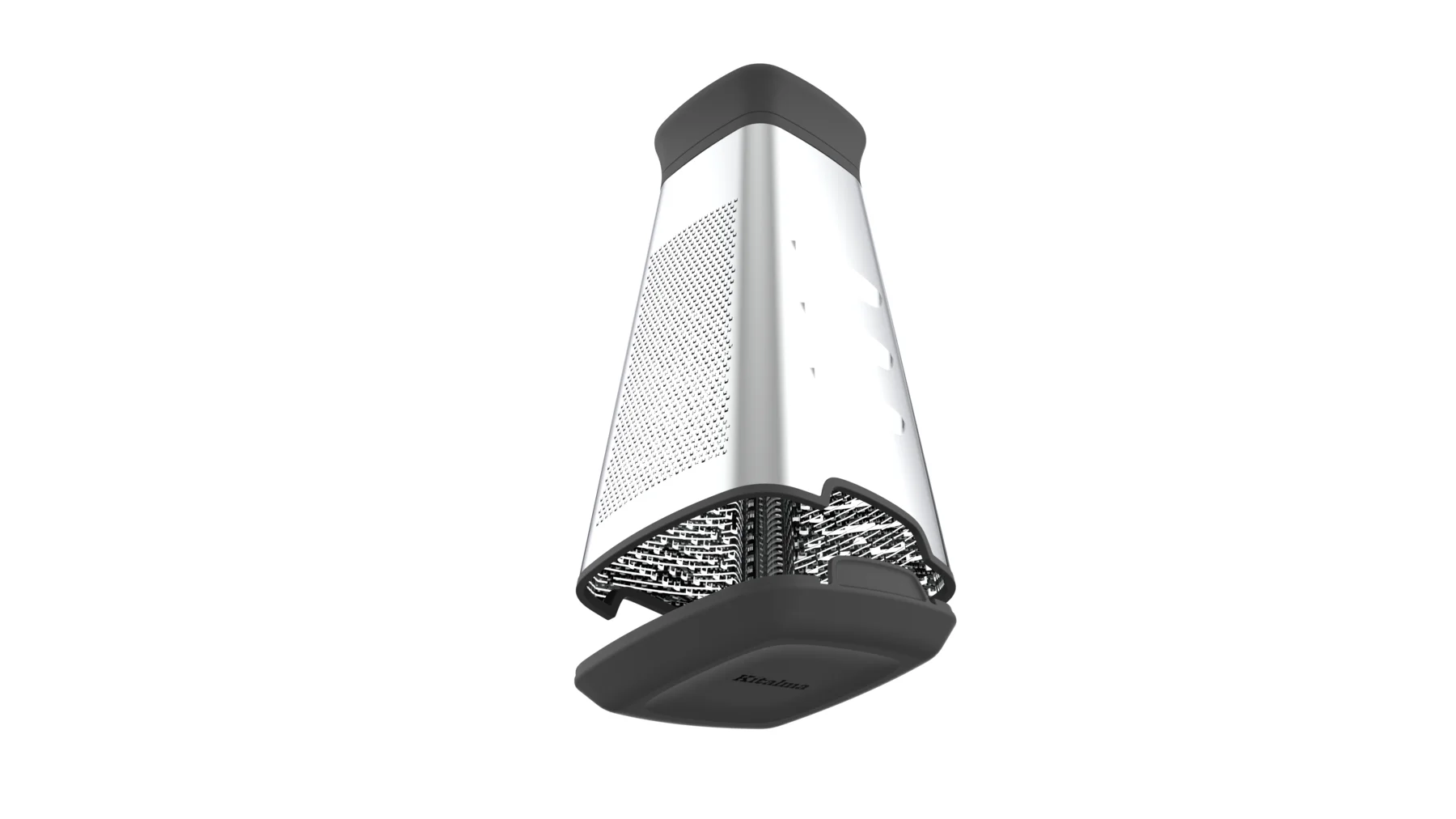
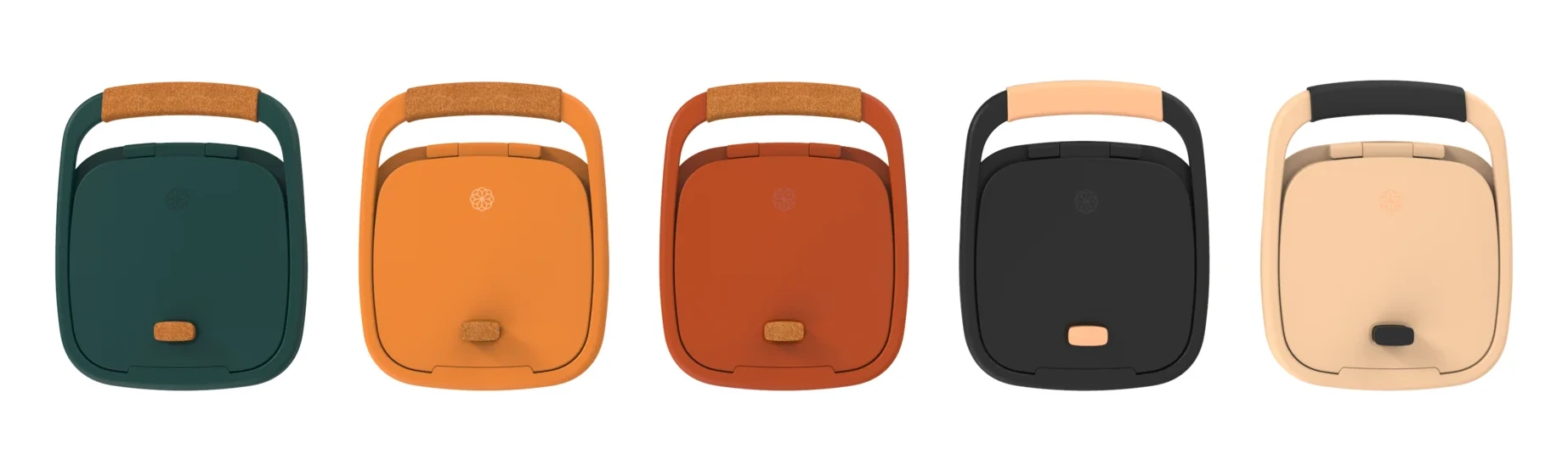
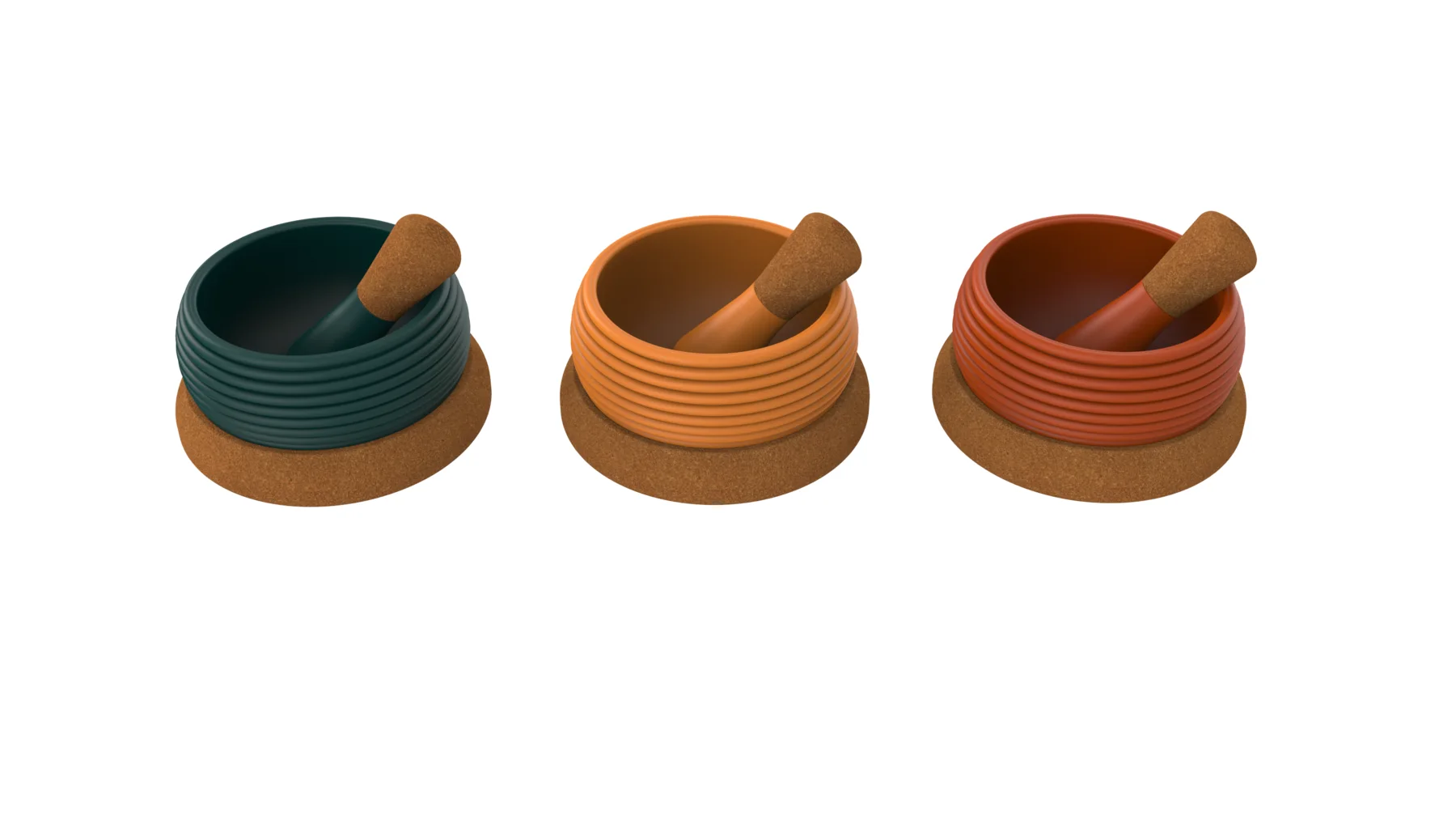
Our industrial design team worked the range in mass first: proportion, stance, how much of each object is body and how much is handle. Options were drawn flat so the family could be judged as a set, then rendered to test how a bamboo band, a cork base and a matte body read together.
What emerged is a design language: soft-cornered volumes, a banded middle, a lifted base, a warm-material handle. One silhouette per function, recognizable across a kitchen.


Brand Identity
Key Outputs
- Brand Strategy & Positioning
- Identity System & Lockups
- Color, Typography & Pattern
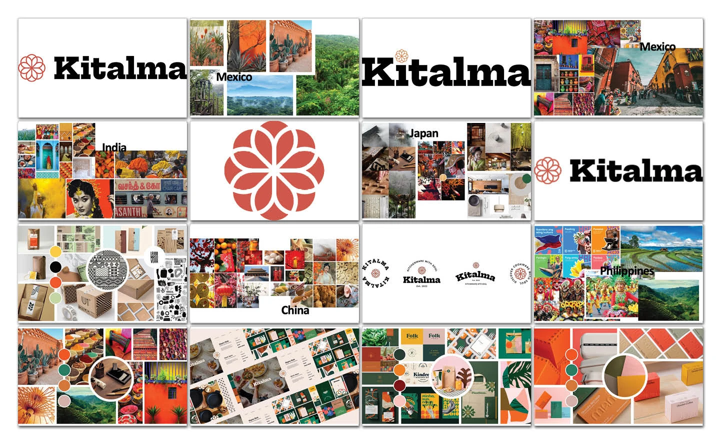
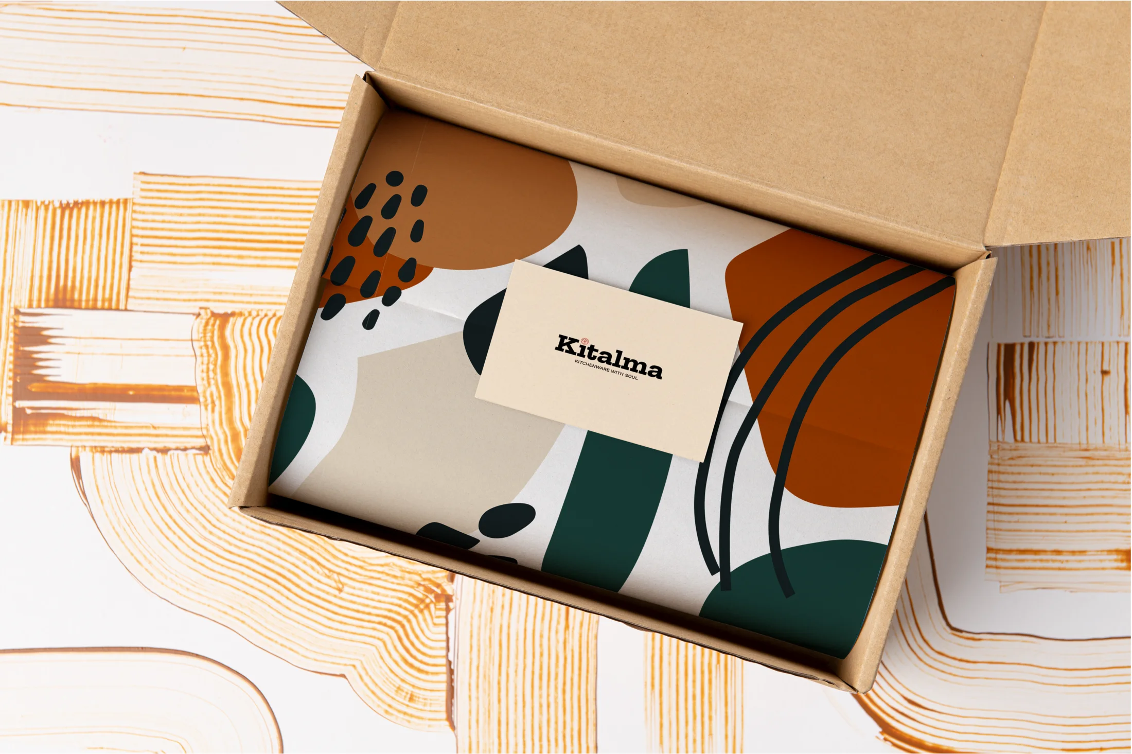
Our branding design team built Kitalma to work as a culinary passport rather than a catalog. The identity had to carry a Latin American collection and a Southeast Asian one without flattening either, and sit as easily on a kraft sleeve as on a storefront.
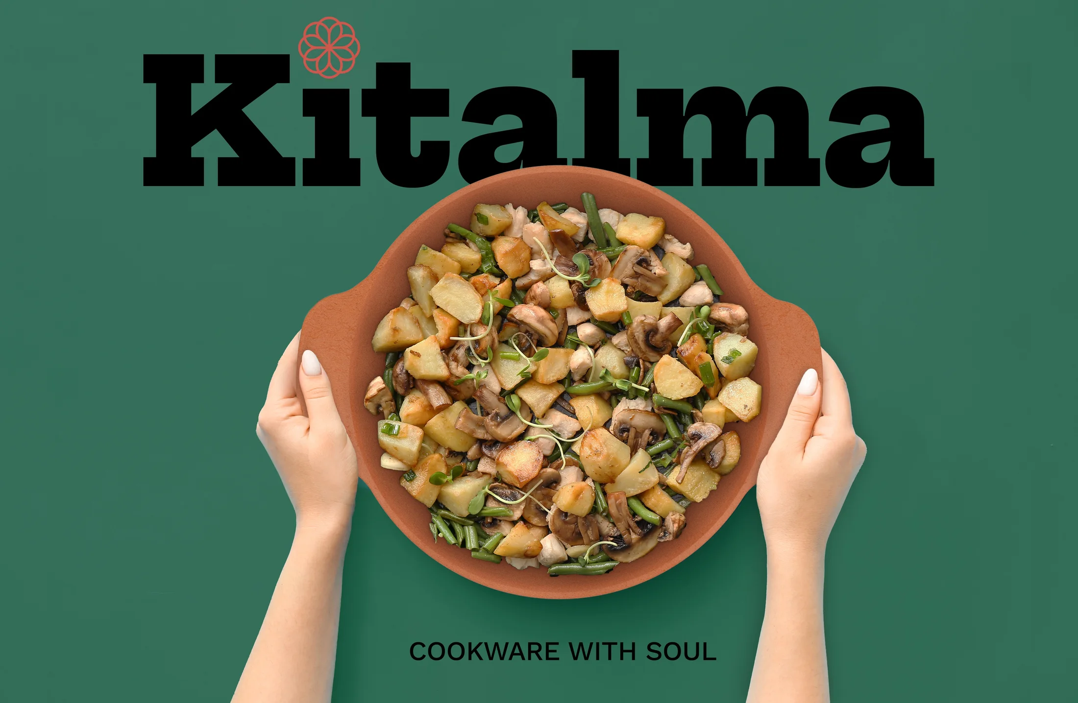
One rosette mark, four colors drawn from raw material, and a slab serif with enough weight to feel inherited.
A rosette that reads as a flower, a spice and a sun
Eight petals worked around a center, close enough to a flower to feel domestic, close enough to star anise or a marigold to belong to the kitchens the brand borrows from. It holds at badge size on a handle and at full scale across packaging, and it works cut out of a color field as readily as drawn in line.

Packaging & Digital Direction
Key Outputs
- Packaging System & Structure
- Stationery & Merchandise
- Website & Social Direction
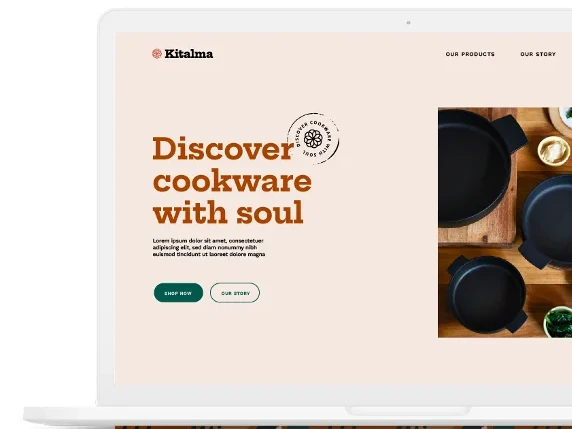
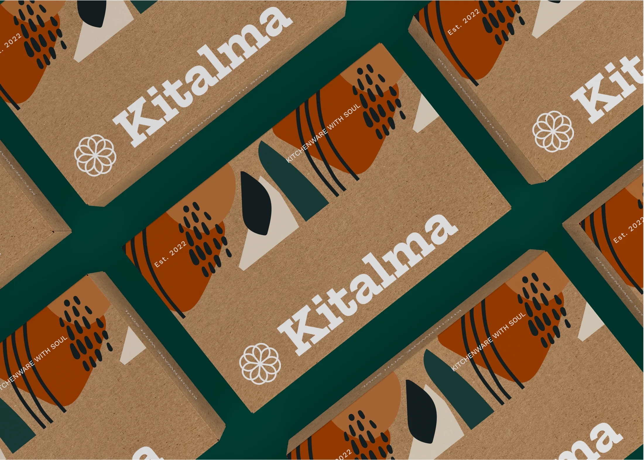
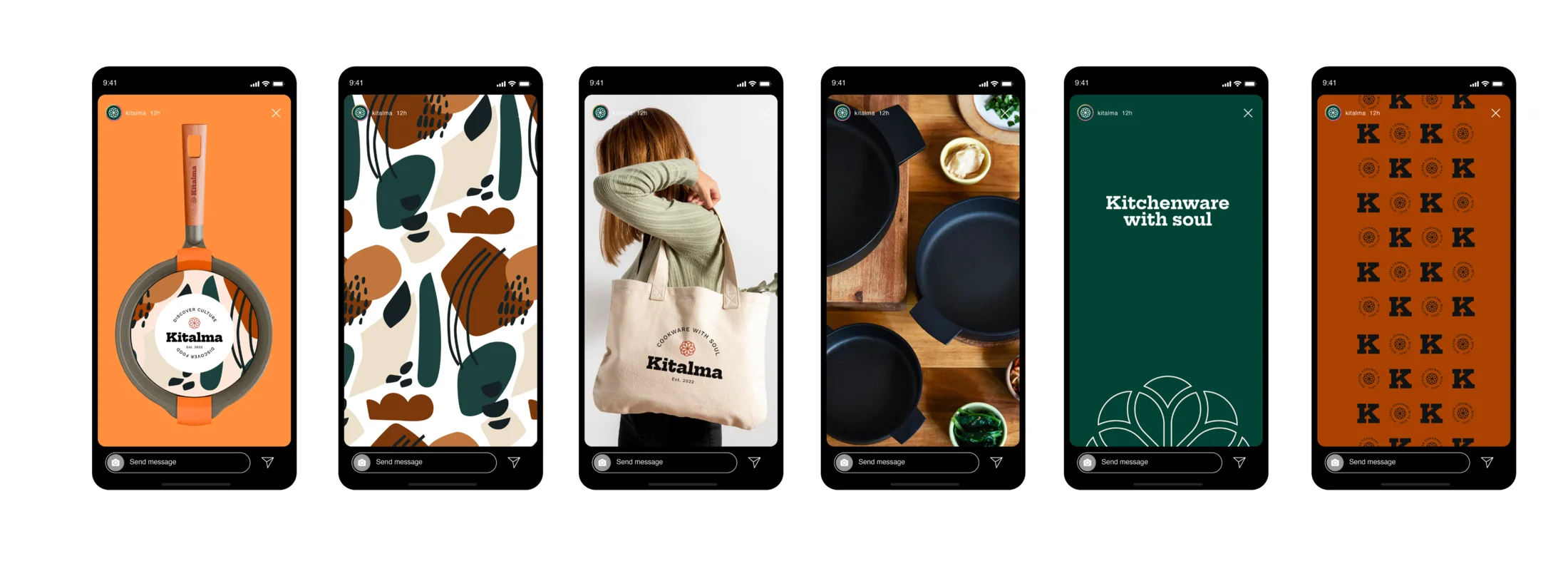
RKS extended the identity into packaging design and digital, where a system either proves itself or falls apart. Printed sleeves and cartons carry the pattern at full strength.
Online, the palette does the work that material does in the hand (clay and jungle green against sand), with the rosette used sparingly enough to stay an identifier rather than decoration.
Outcomes
Key Outputs
- Range in Market Across Three Collections
- Identity, Packaging & Digital Direction
- A Design Language for Ongoing Development
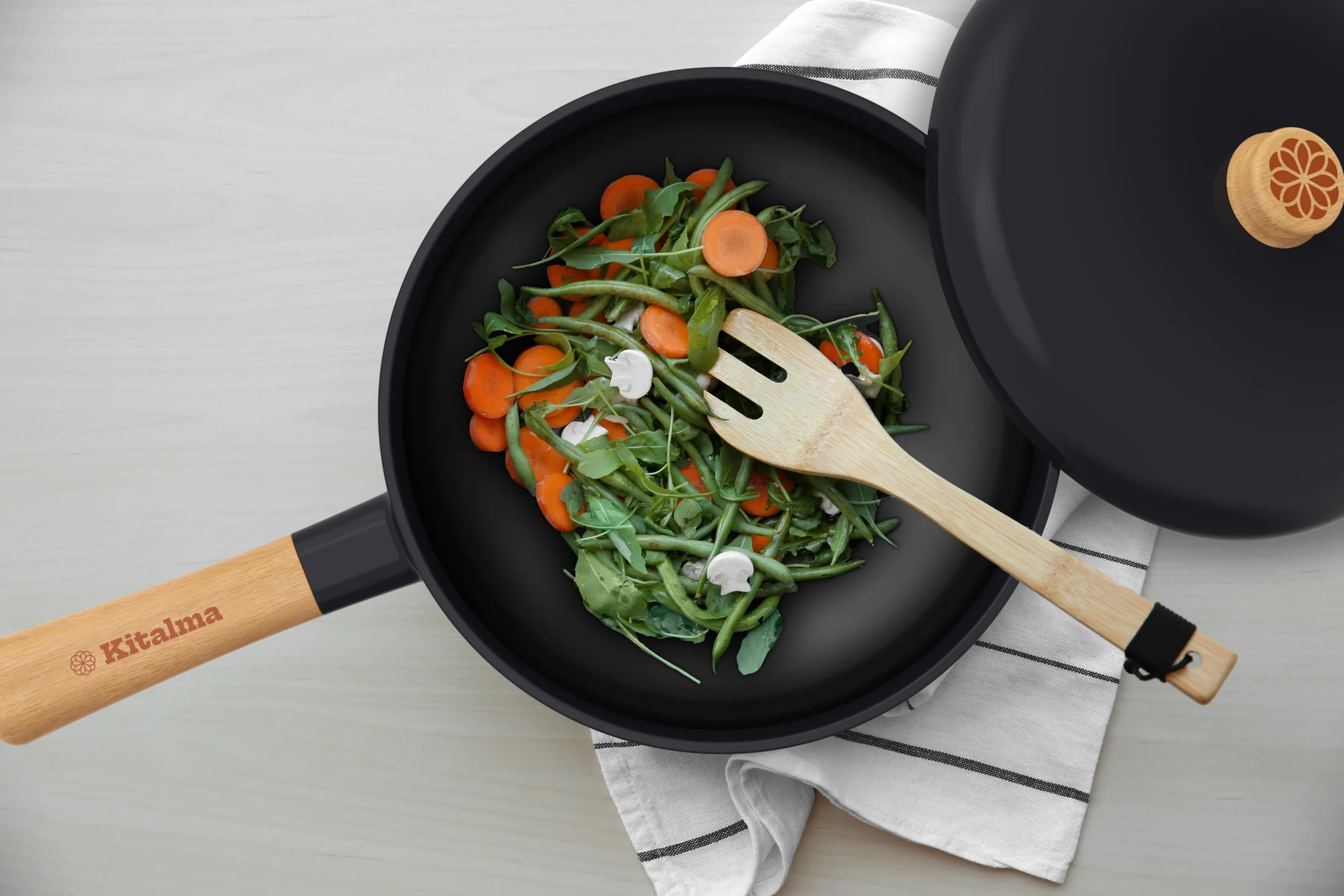
Kitalma reached market as three collections (Journey, Legado and Rasa) built on one design language and spanning cookware, tools and serveware.
The same silhouette logic runs from the clay pot to the press. New products join the family without a redesign, and each collection can lean into its own region without leaving the brand. See more of our work for the consumer market.
Let’s move together.
Get in touchExplore More Work
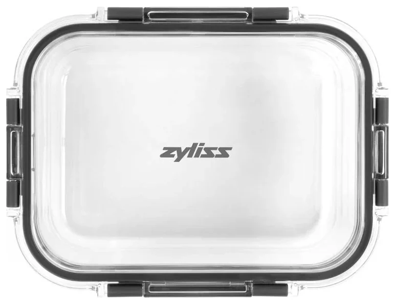
Zyliss Food Storage
An integrated food storage system, from Psycho-Aesthetics® strategy to production-ready engineering.
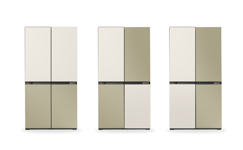
Samsung Bespoke
Research, color strategy and retail concepts for Samsung’s modular kitchen line.
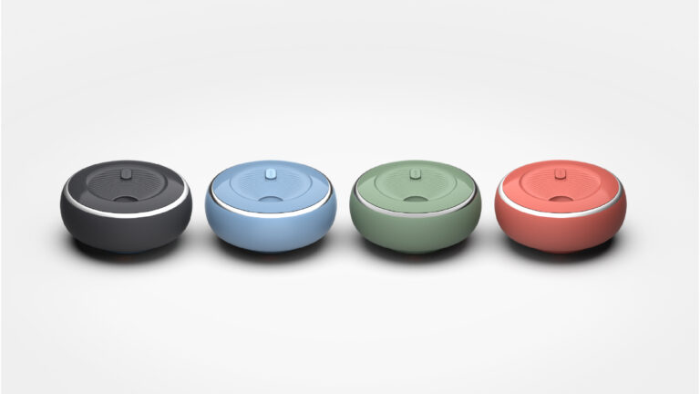
My Dabba
A new category in smart culinary design.
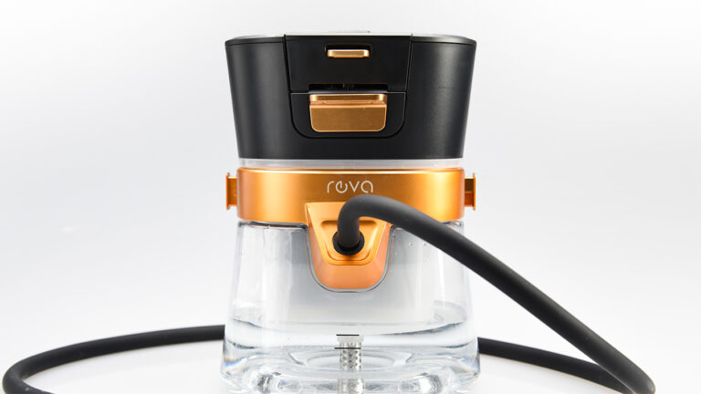
Reva
Rethinking a category from the inside out.
Zyliss
Creating iconic kitchen gadgets that rise above the rest.
Vorso
Neuroscience-driven wearable for chronic condition therapy.
Elevate Grill
A compact, portable grilling experience.
Baby Barista
The perfect baby bottle formula in less than a minute.