
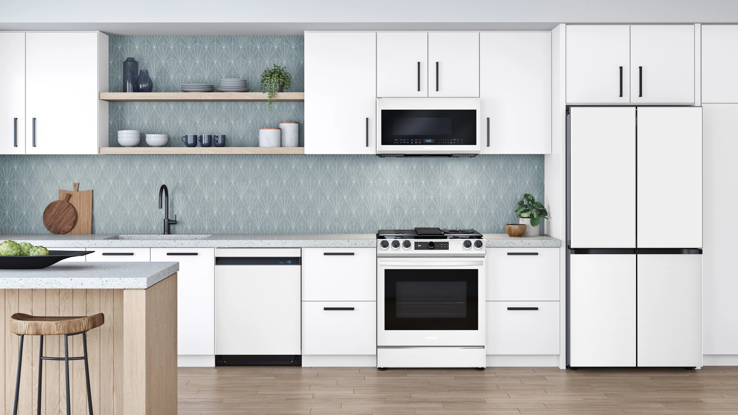
The kitchen has become the most personal room in the house.
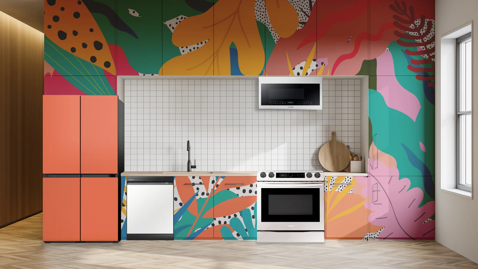
Samsung came to RKS with Bespoke already on shelves and a question: what should personalization look like in an American kitchen? Drawing on our work in home appliance design, we helped translate its interchangeable-panel system into a palette of colors and finishes, pairing guidelines, and retail experiences that made the possibilities easier to explore.
Research
Key Outputs
- Ethnographic Research & Interviews
- Consumer Insights
- Retail Benchmarking
A kitchen says a lot about the people who live in it. Through ethnographic research, retail benchmarking, and interviews with US homeowners, renters, and creators, we explored how people make that space their own.
We found that people wanted individuality, but were cautious about committing to a look. Their tastes could change long before their refrigerator needed replacing. That gave Bespoke’s interchangeable panels a meaningful role: allowing the appliance to evolve with the home.
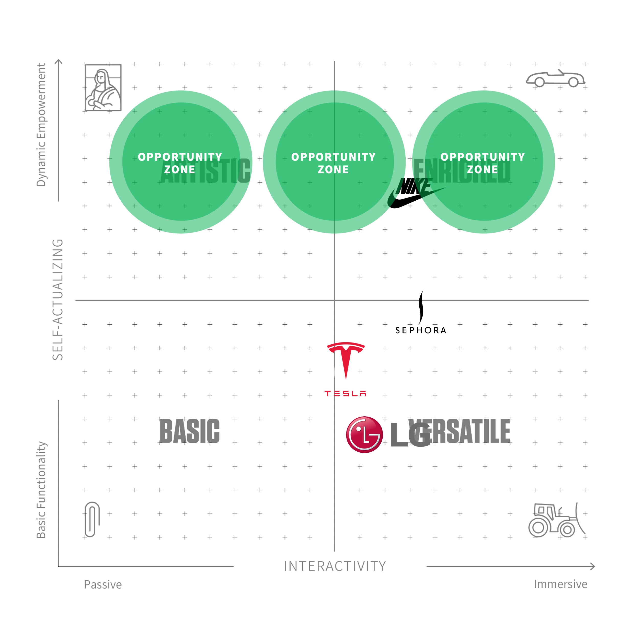
How We Used Psycho-Aesthetics® to Identify Unique Opportunities in the Project.
Using the Psycho-Aesthetics® methodology, RKS mapped the emotional motivations behind how people choose and personalize their kitchens, including self-expression, pride of ownership, and the freedom to change their minds. The opportunity for Bespoke was to make choosing an appliance feel more personal. Color, finish, and the ability to change both could give owners a stronger connection to something they use every day.
Concept Exploration
Key Outputs
- Color & Finish Directions
- Palette Exploration
- Kitchen Context Renderings
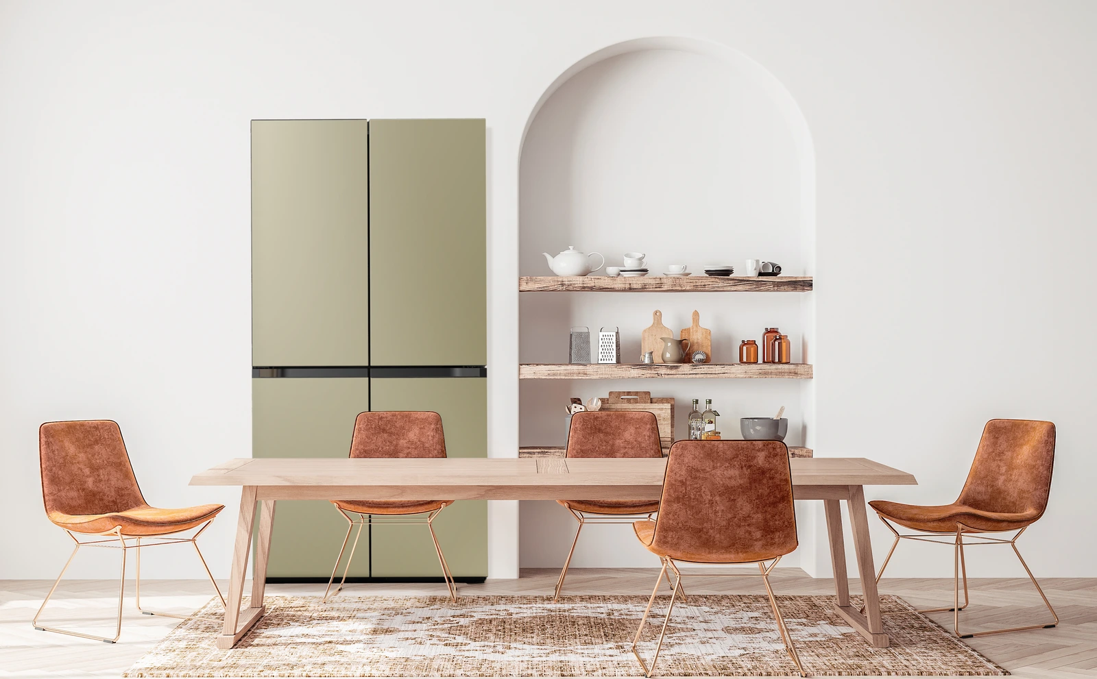
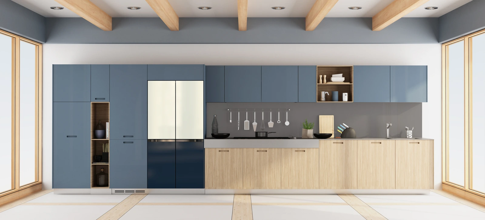
We began with the room, considering how each panel would sit alongside cabinetry, countertops, and natural light. Our exploration followed three directions: colors drawn from nature, bright accents influenced by digital culture, and soft pastels that brought a sense of calm.
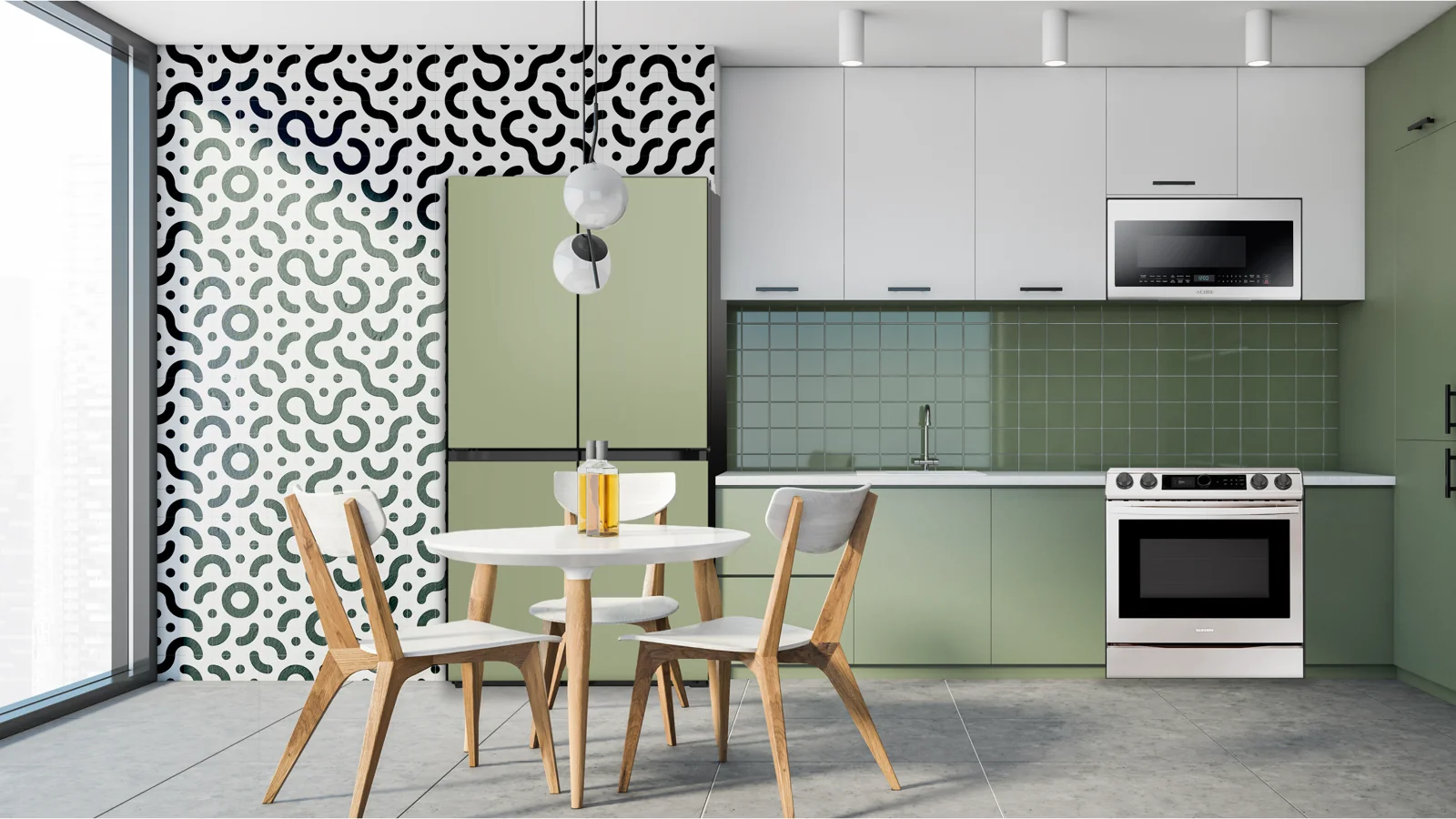
These directions developed into a recommended palette led by Indigo Slate, Terracotta, and Wasabi Sage. We rendered the colors in complete kitchens to explore how each could find a place in the home.
Overall Themes
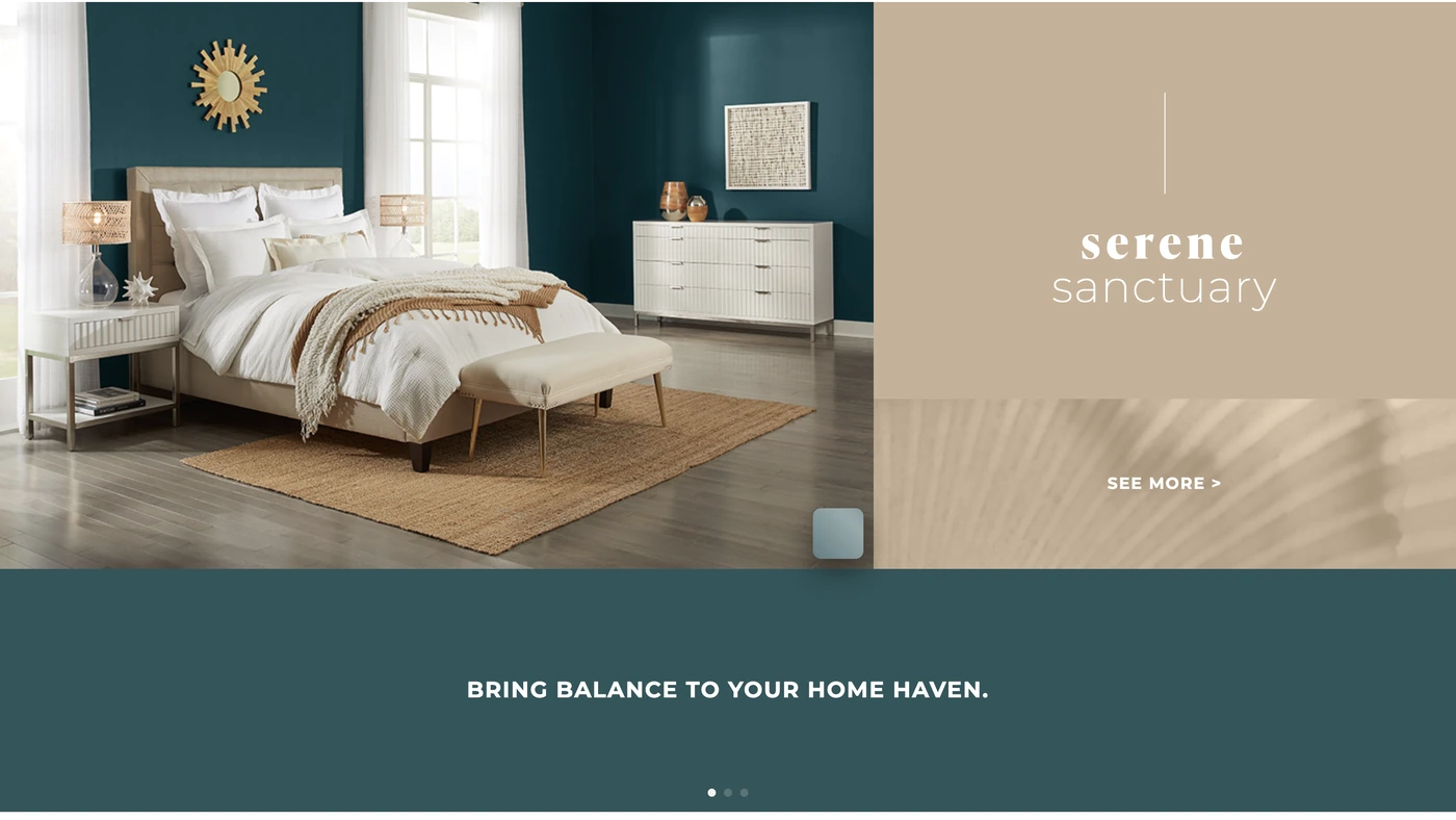
- Serene SanctuaryA desire to make the home a sanctuary, with minimal decoration, room to breathe, and the simplicity of a monochromatic palette.
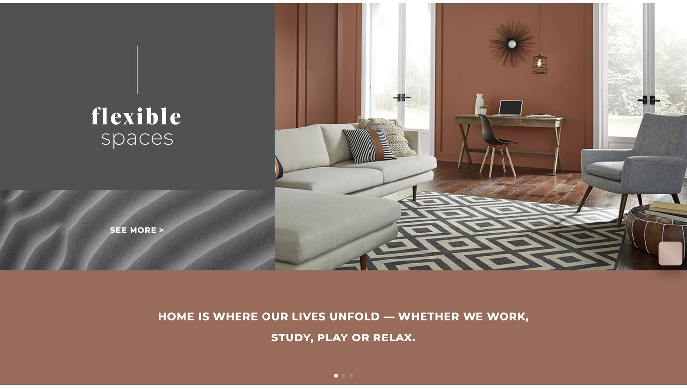
- Flexible SpacesWork and home are now intertwined, and a single room has to accommodate several lives over the course of a day.
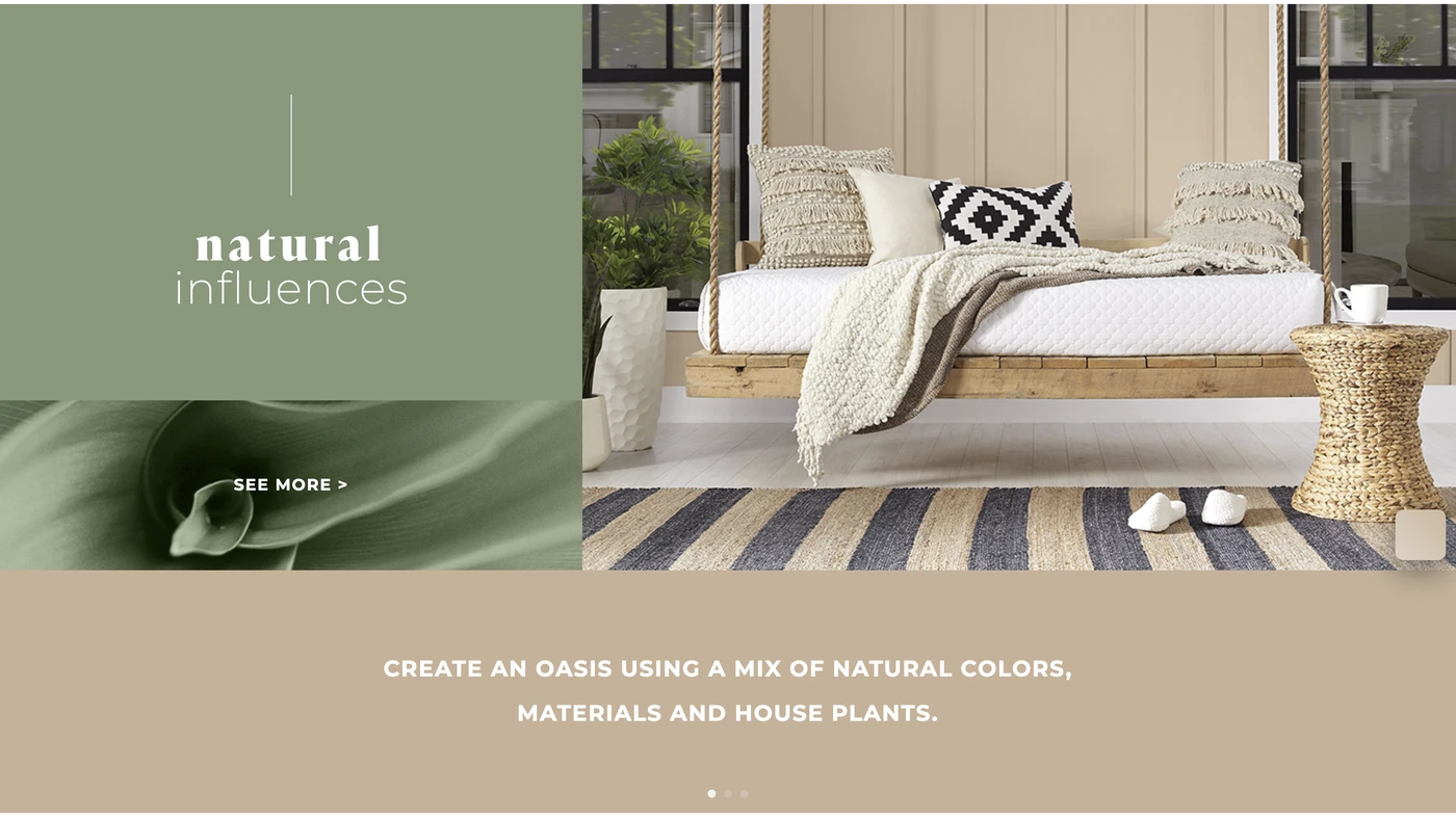
- Natural InfluencesLiving in harmony with nature. Bright color wears thin over long stretches indoors, where beige and light tints create a more natural atmosphere.
Strategy & Design
Key Outputs
- Recommended Color & Finish Palette
- Color Pairing Guidelines
- Interactive Panel Display Concept
- Digital Configurator Concept
- Retail Experience Storyboards
Our industrial design team created pairing guidelines to make the palette easier to use, organizing colors into light, mid, and dark neutrals with bold accents. Consistent, complementary, and contrasting combinations offered different levels of expression, with lighter panels above and darker panels below providing balance.
Through our innovation consulting work, we also designed two retail concepts that gave shoppers room to experiment. An interactive wall let them swap physical panels and see the display respond. A digital configurator let them explore the full range and take a favorite combination home for consideration. Storyboards mapped each experience from discovery through selection.
Outcomes
Key Outputs
- Final Color & Finish Recommendations
- Palette Application Guidelines
- Fully Rendered Kitchen Environments
- Two Storyboarded Retail Concepts
RKS delivered a defined color and finish palette, pairing guidelines, fully rendered kitchens, and two retail concepts with complete storyboards.
The work gave Samsung a direction for bringing Bespoke into American homes, connecting the colors people could buy with the spaces they lived in. It also left room for those spaces to change. See more of our work for the home appliance market.
Let’s move together.
Get in touchExplore More Work
Kitalma
Brand, packaging and a cookware design language for a culinary passport in the home kitchen.
Zyliss Food Storage
An integrated food storage system, from Psycho-Aesthetics® strategy to production-ready engineering.
My Dabba
A new category in smart culinary design.
Reva
Rethinking a category from the inside out.
Vorso
Neuroscience-driven wearable for chronic condition therapy.
Zyliss
Creating iconic kitchen gadgets that rise above the rest.
Miravel
A wall-mounted hydroponic pond that raises AI’s elegance to grow any small plant at home.
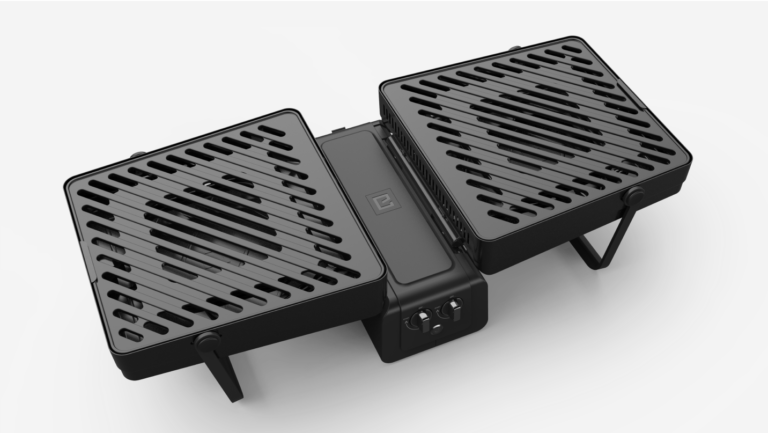
Elevate Grill
A compact, portable grilling experience.