
Empowerment through purity.
The sports drink category is overcrowded with sugary, artificial options promising energy boosts and flavor overload. EDGE emerged to provide a sophisticated alternative, rooted in science, wellness, and simplicity. RKS was tasked with defining the EDGE brand from the ground up, turning an unmet consumer need into an emotionally resonant, scalable beverage platform.
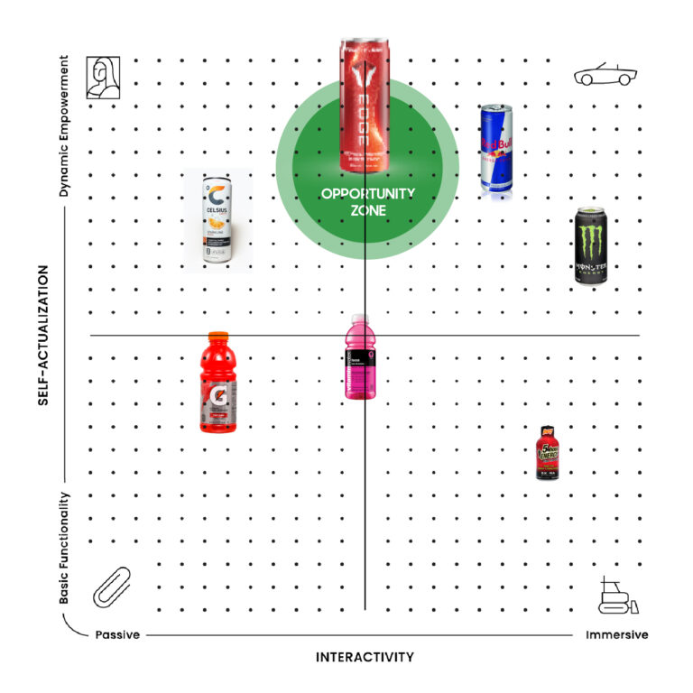
We used ethnographic and quantitative tools to uncover how health-conscious consumers desired clarity, empowerment, and trust, without overblown claims. Through our Psycho‑Aesthetics® methodology, we defined EDGE’s emotional sweet spot: clean, confident, and modern.
Brand Strategy & Psycho‑Aesthetics®
Key Outputs
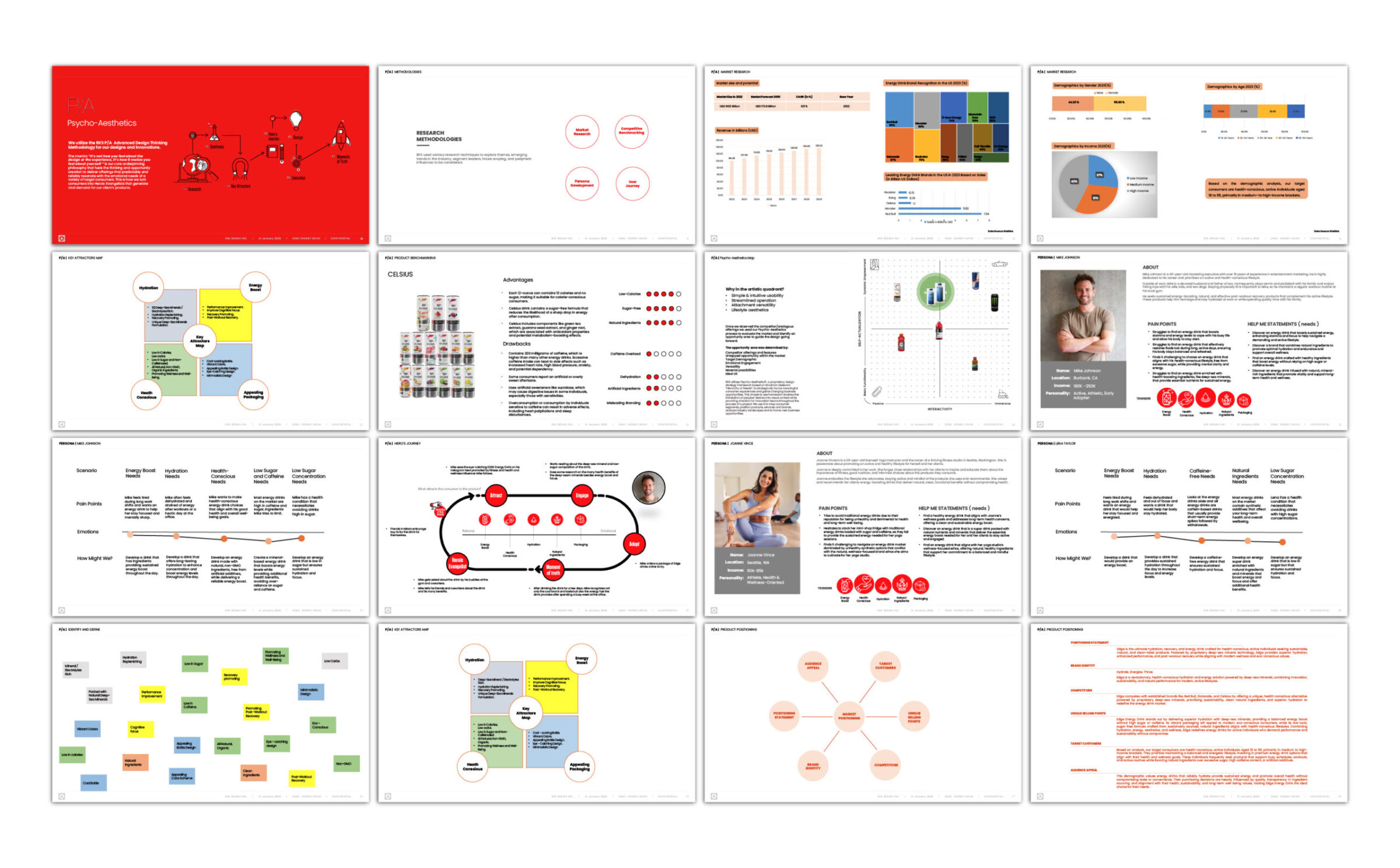
- Personas across fitness conscious, productivity focused, and wellness oriented users
- Psycho-Aesthetics® 2.0 Map
- Benchmarking
- Brand voice and naming framework aligned with science and simplicity
We used ethnographic and quantitative tools to uncover how health-conscious consumers desired clarity, empowerment, and trust, without overblown claims. Through our Psycho‑Aesthetics® methodology, we defined EDGE’s emotional sweet spot: clean, confident, and modern.
How We Used Psycho-Aesthetics™ to Identify Unique Opportunities in the Project.
Using our proprietary Psycho-Aesthetics® 2.0 framework, we conducted in-depth interviews and ethnographic observation in diverse lab settings. We identified key emotional and usability pain points, such as intimidation with complex interfaces, workspace clutter, and trust in precision. These insights guided both the form and interface strategy, ensuring approachability and confidence in operation.
Naming, Visual Identity & Packaging
Key Outputs
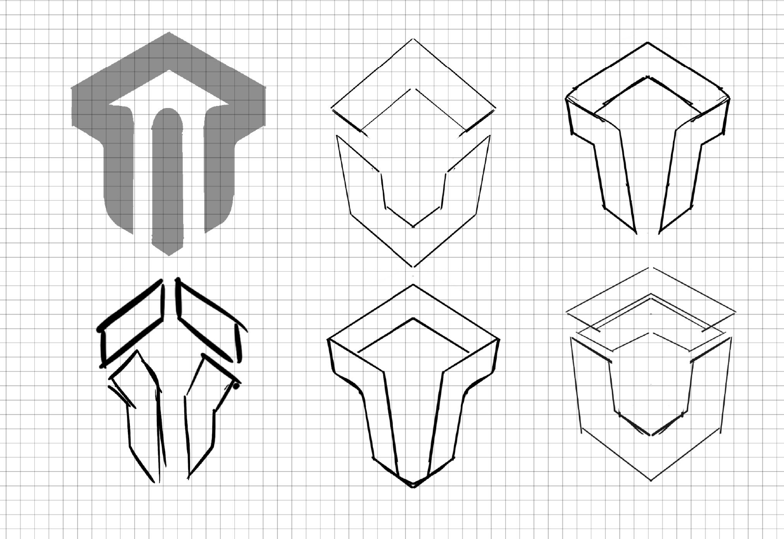
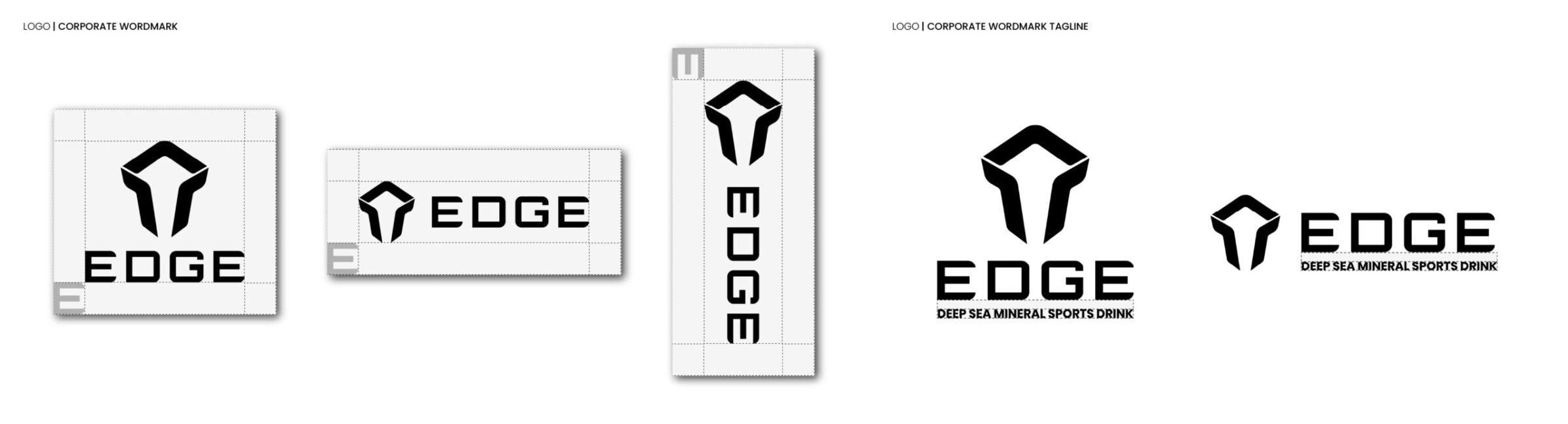
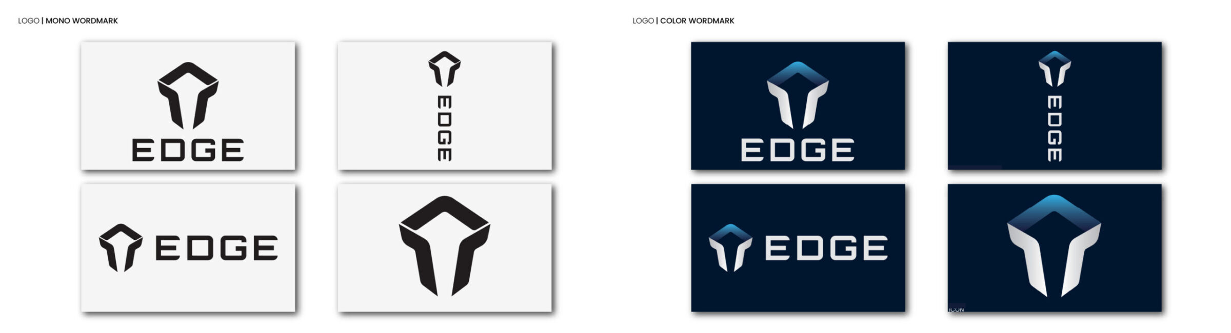
- Logo and icon system inspired by hydration, protection, and scientific simplicity
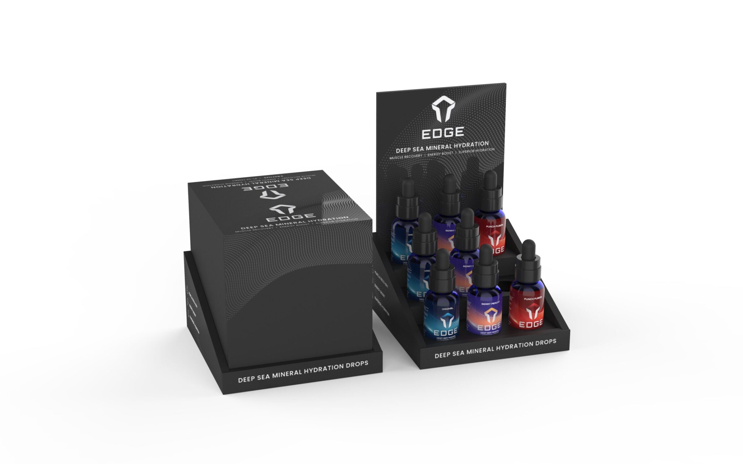
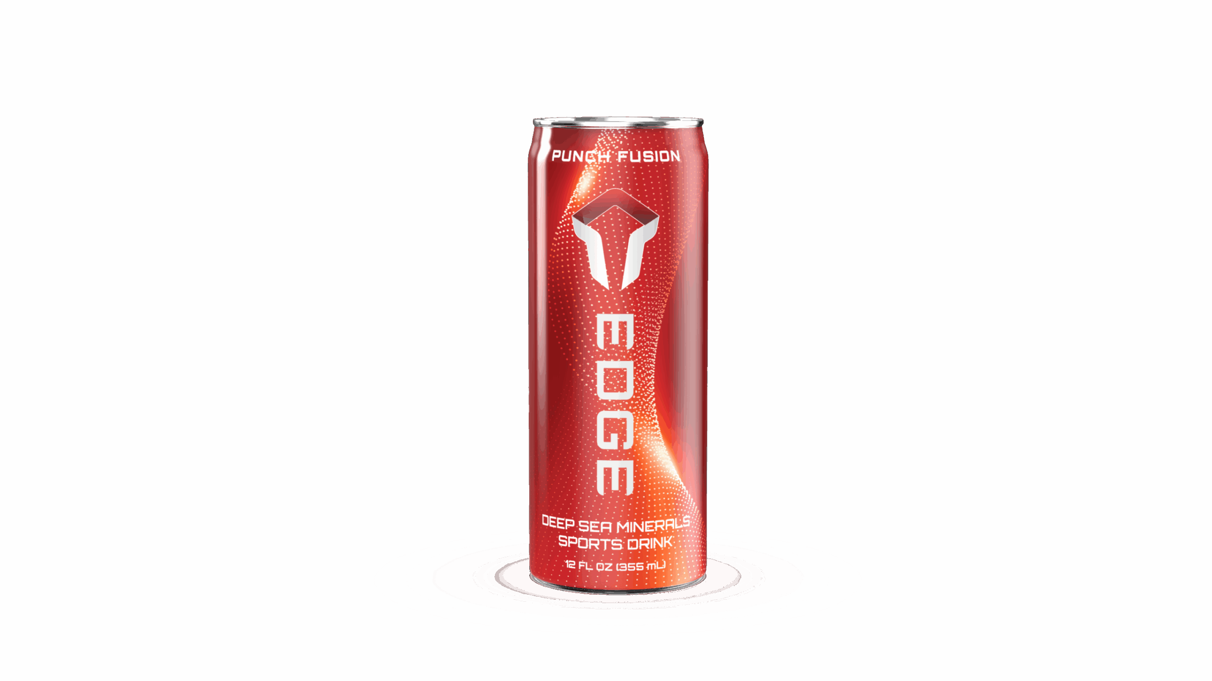
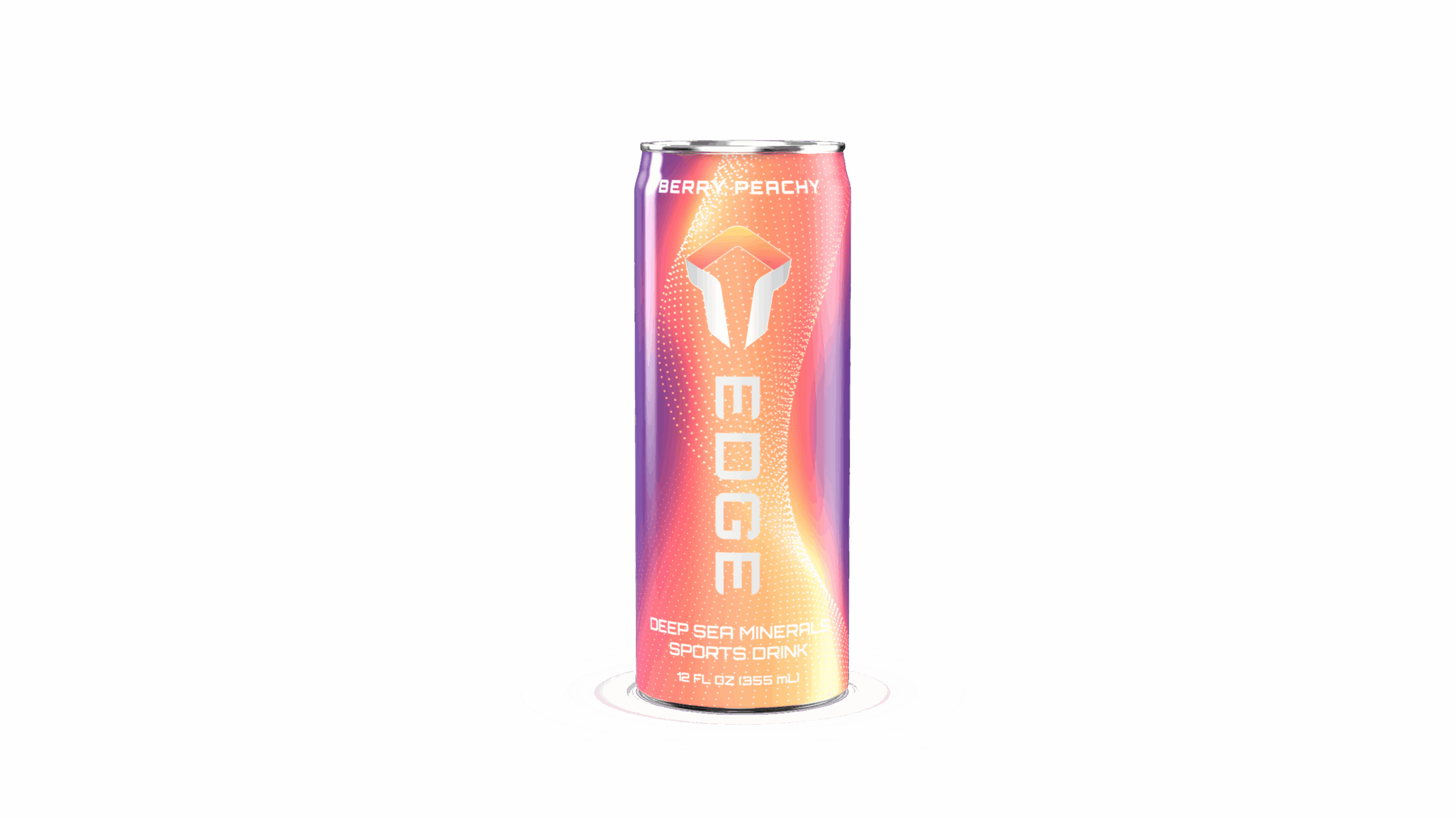
- Packaging templates with flavor-coded cues and modular expansion capability
- Foam prototypes and printed mockups tested for shelf visibility and tactile appeal
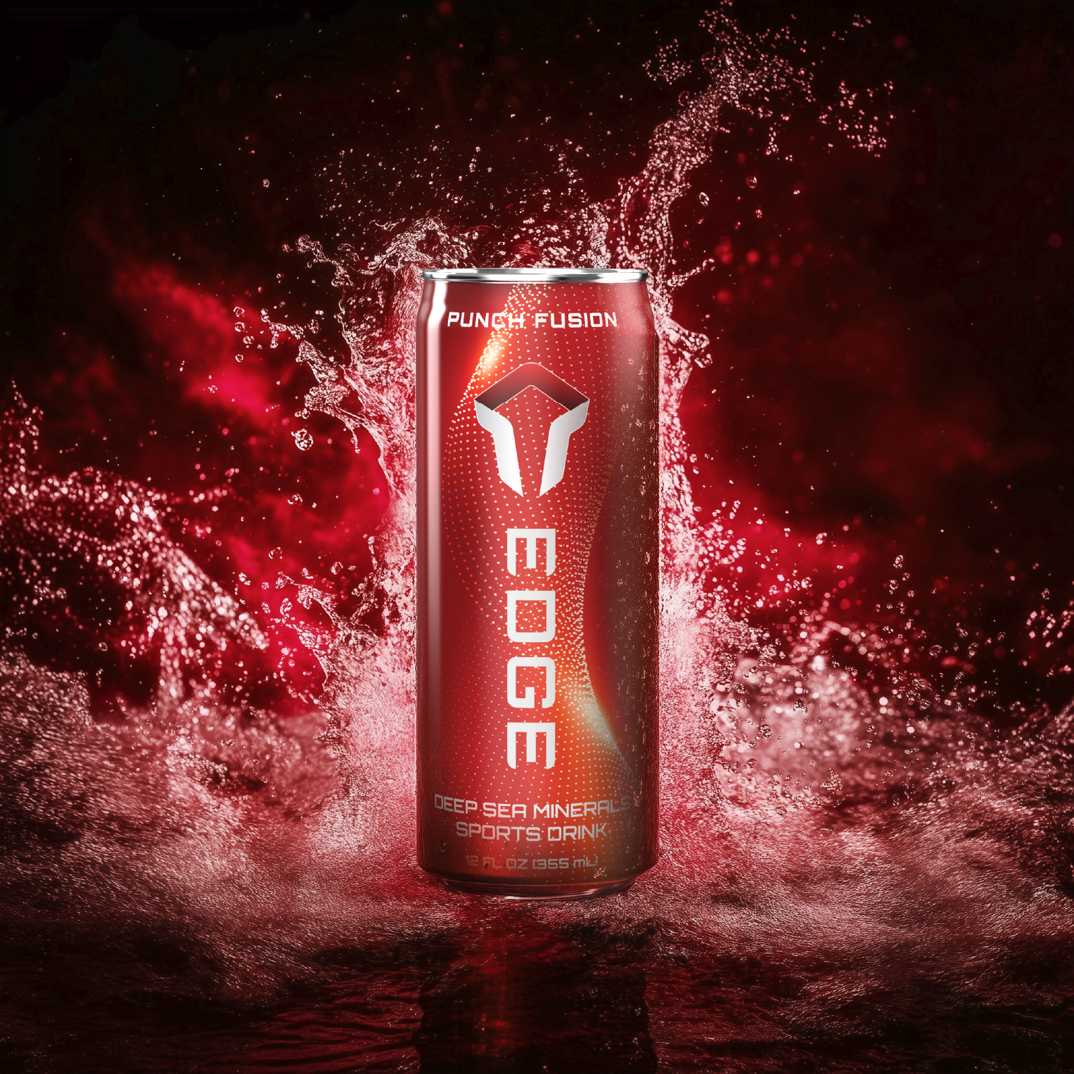
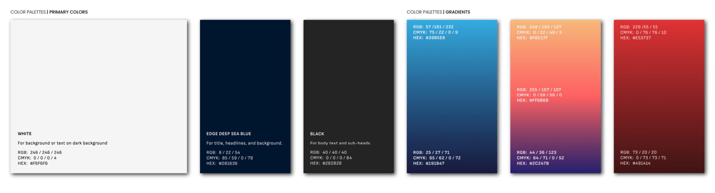
Working from a core concept of deep-sea mineral purity, we crafted the name EDGE, along with a strong geometric wordmark echoing precision. Packaging designs spotlighted bold droplet-shield iconography and a clean color palette, ensuring each SKU stood out on shelf while remaining part of a coherent, scalable system.
Innovation Consulting & Ethnography
Key Outputs
- Shelf audit reports comparing artificial vs clean label categories
- User journey maps showing buying triggers and trust signals
- Formal design criteria document bridging emotional and functional requirements
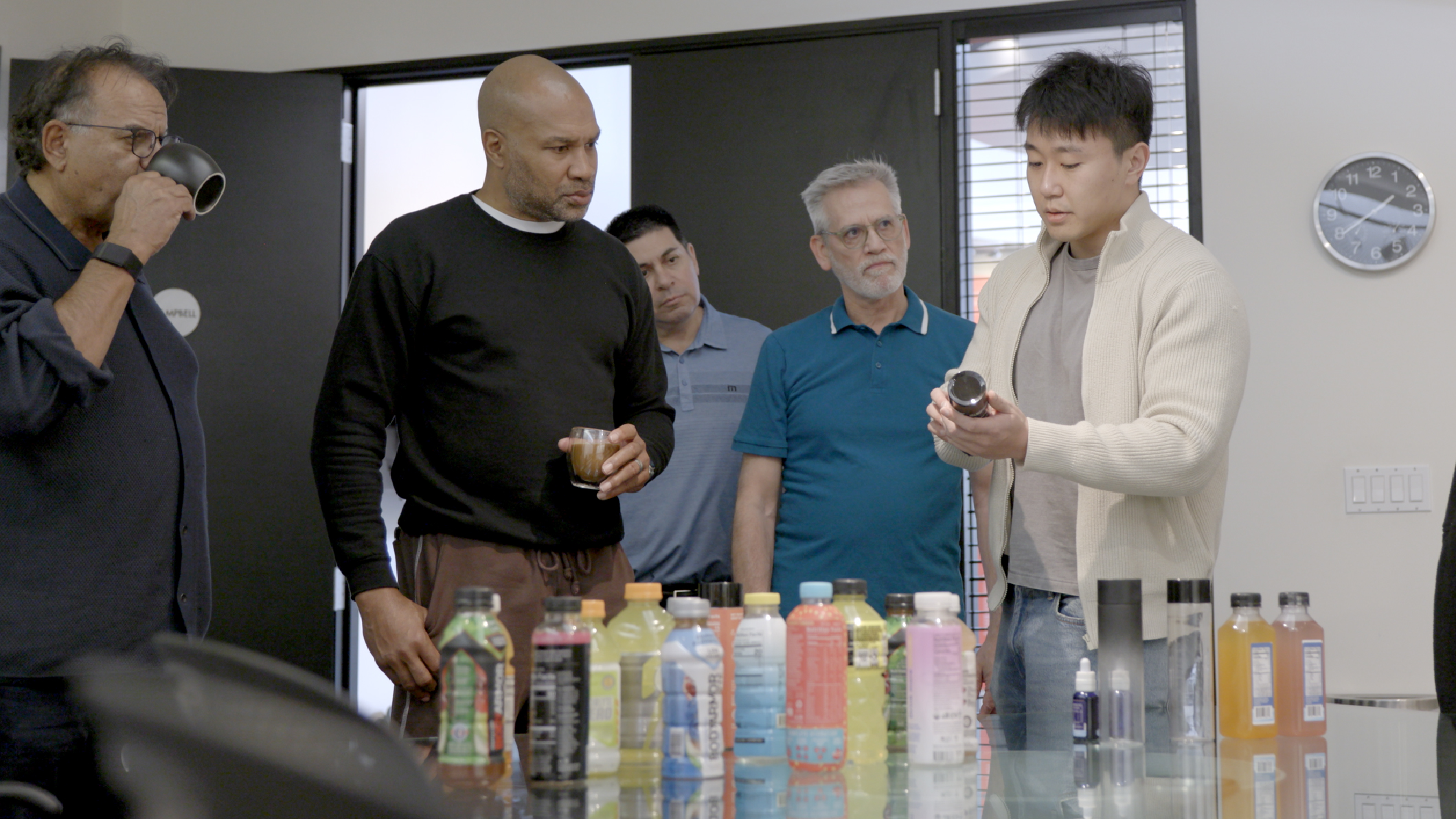
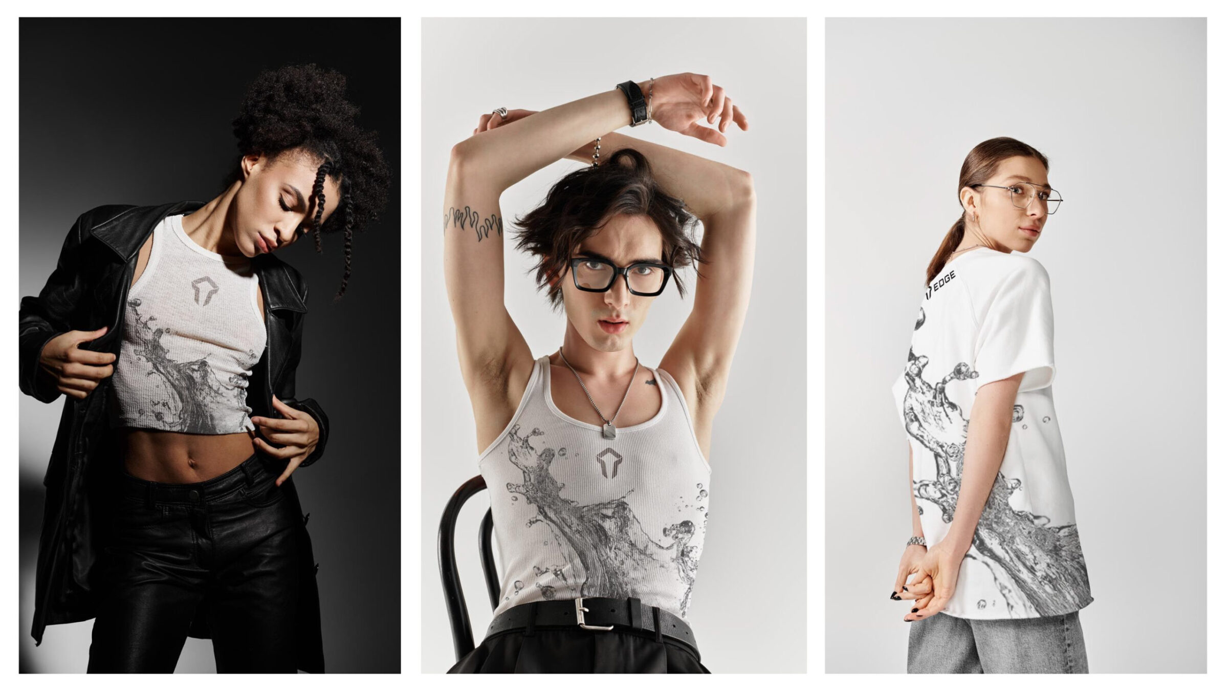
Through competitor benchmarking and ethnographic research in gym, office, and athletic environments, we tested key brand assumptions. We identified opportunities around sincerity, ingredient clarity, and adult positioning, guiding packaging, messaging, and product line evolution.
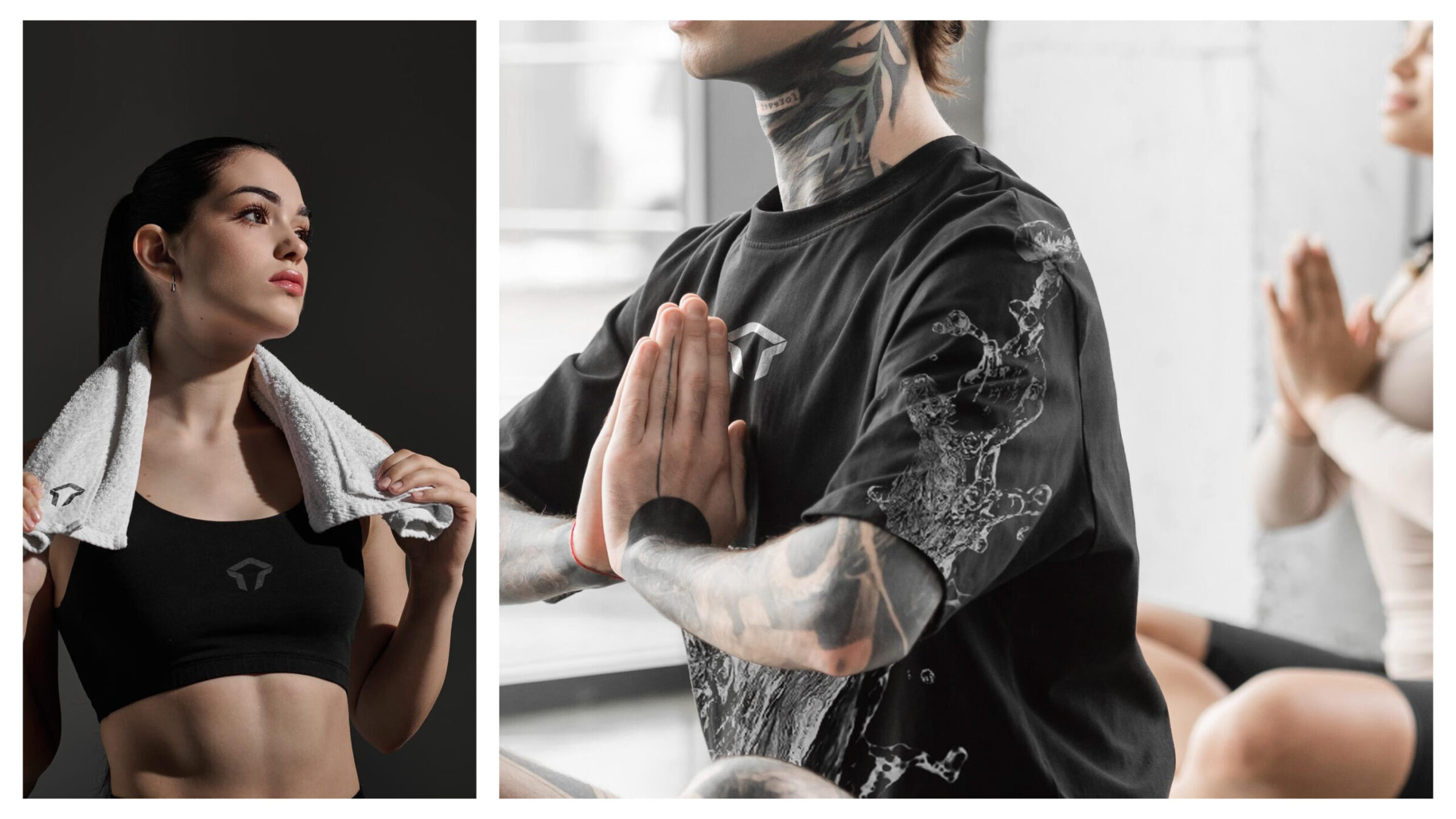
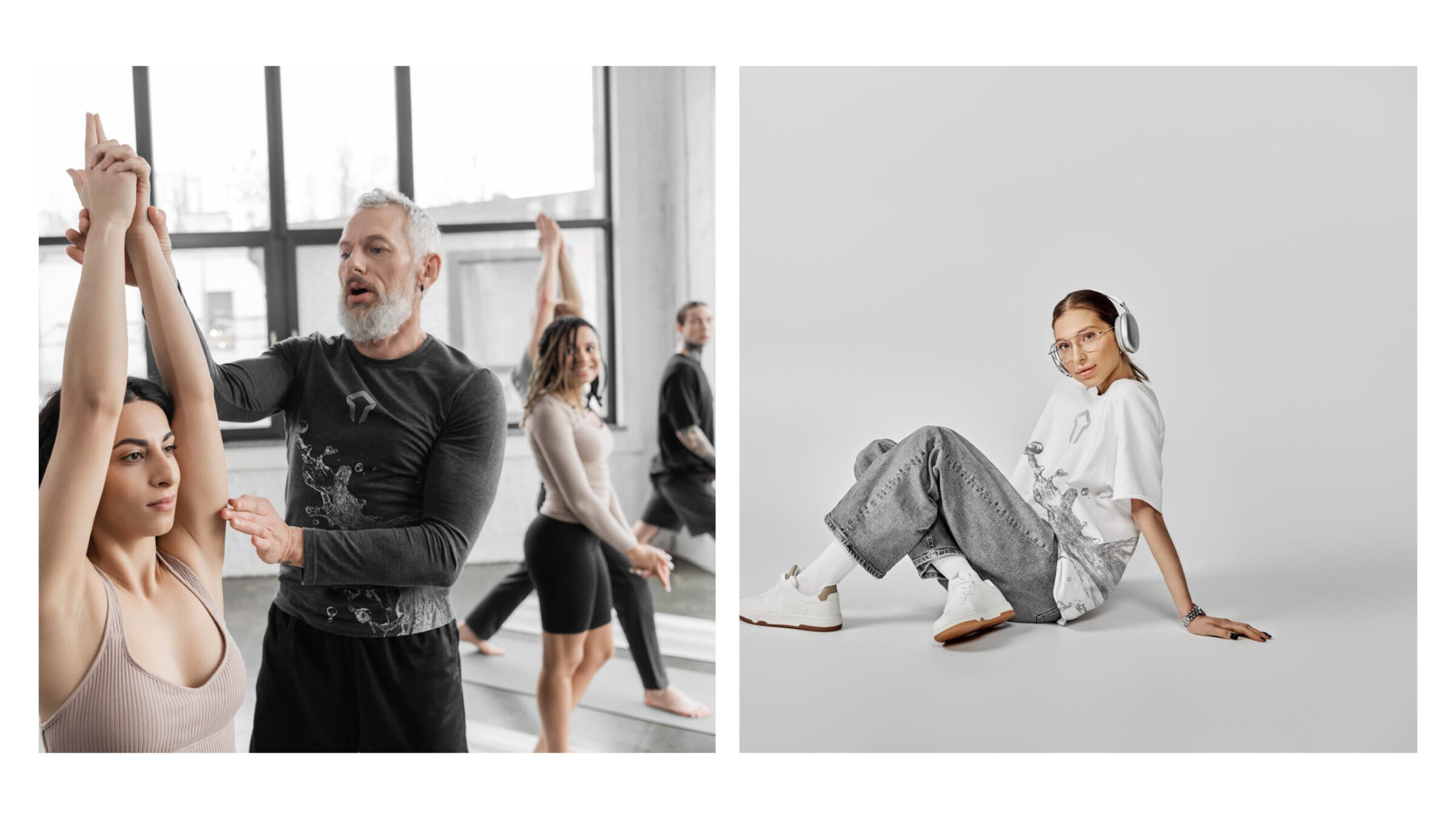
Key Outcomes and Results
Key Accomplishments
- Status: EDGE launched as a functional sports drink line, across cans and dropper kits
- Impact:
- Brand built to scale across multiple SKUs, drops, powders, ready-to-drink
- High-performance, clean hydration positioned to disrupt sugary alternatives
- Market Positioning:
- Communicates science-grounded wellness without hype
- Aesthetic clarity reinforces brand trust and expansion potential
EDGE demonstrates RKS’s capacity to build entire product platforms, from insight-driven naming and visual systems to packaging that feels premium, transparent, and future-proof. By fusing consumer empathy, emotional design, and system thinking, RKS helped launch a brand that embodies simplicity, transparency, and modern performance.
ready to partner with us?
Contact UsExplore More Work
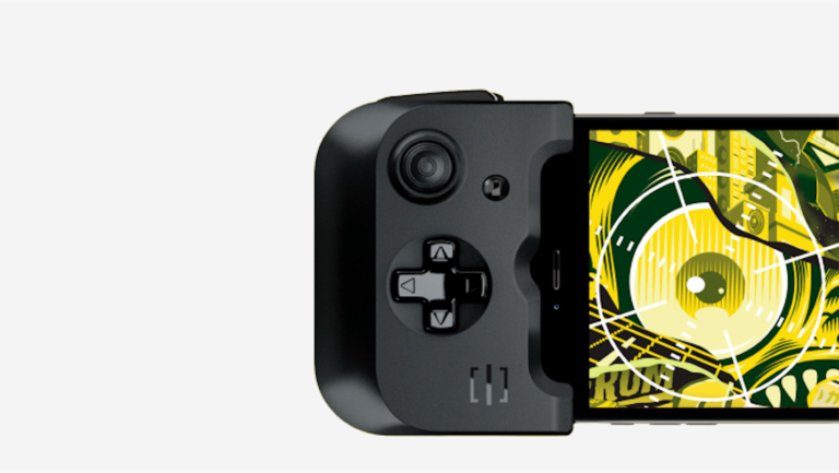
Gamevice
A new mobile gaming category that enables gamers to play on the go with physical controls and zero latency.
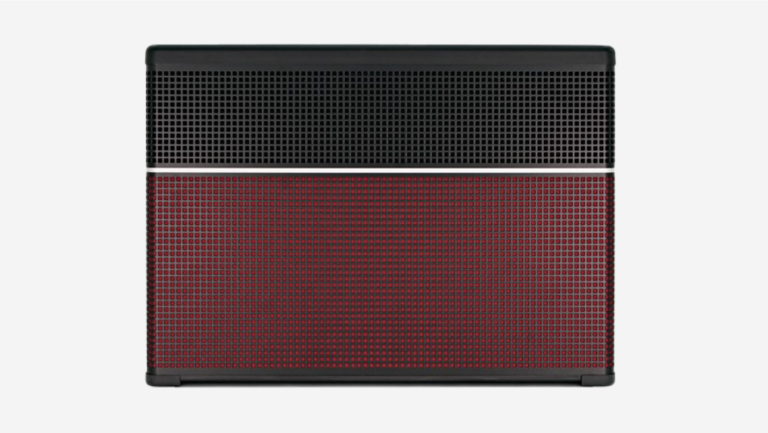
Line 6
A smart, high-performance guitar amp designed to amplify the unique sound of your favorite guitar.
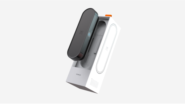
Xcinex Venue
Bringing the Big Screen to the comfort of your home.
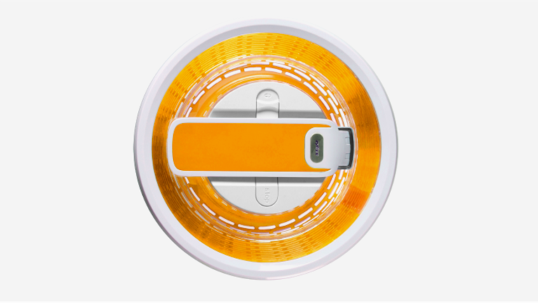
Zyliss
Creating iconic kitchen gadgets that rise above the rest.
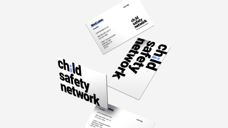
Child Safety Network
Repositioning a brand in its 30th year to help appeal to millennial parents and facilitate fundraising to ensure the safety of kids.
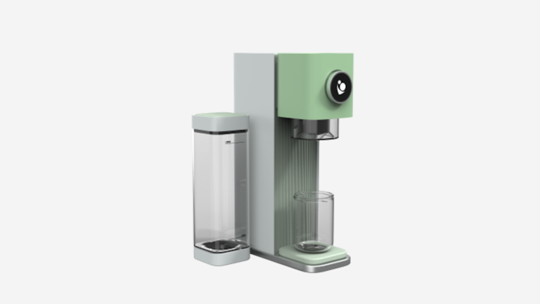
Baby Barista
The perfect baby bottle formula in less than a minute.
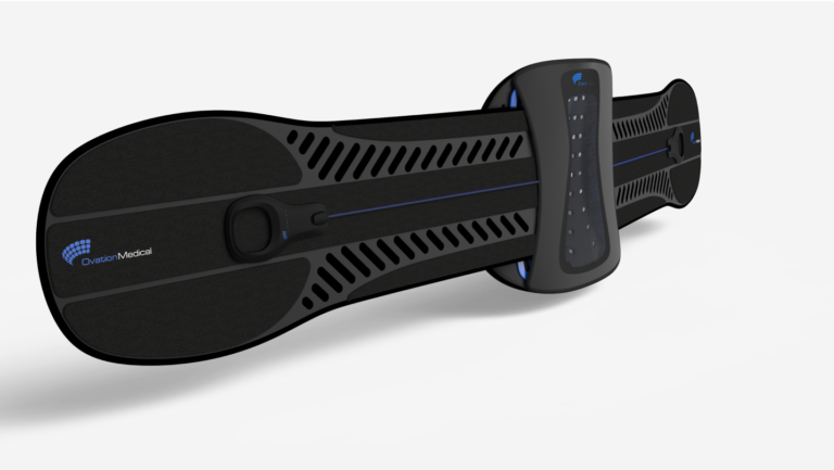
Ovation
Active influenced back brace that delivers support through a streamlined design.
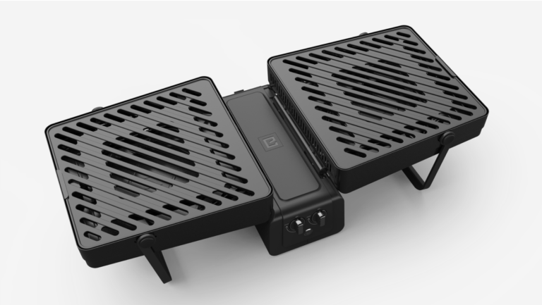
Elevate Grill
A compact, portable grilling experience.
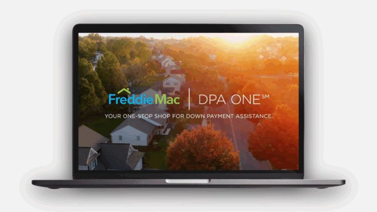
DPA ONE®
Reimagining homeownership access through human-centered innovation.
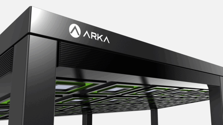
Arka Power Gazebo
Elegant solar powered outdoor living.
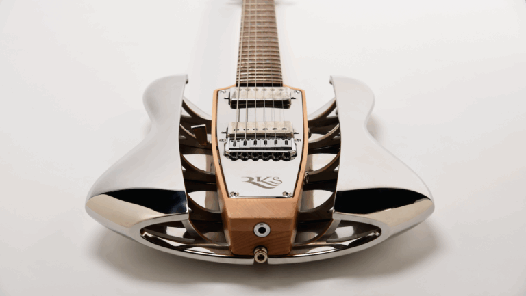
RKS Guitars
Reinventing the electric guitar to drive sustainability and increase usability for the optimal playing experience.
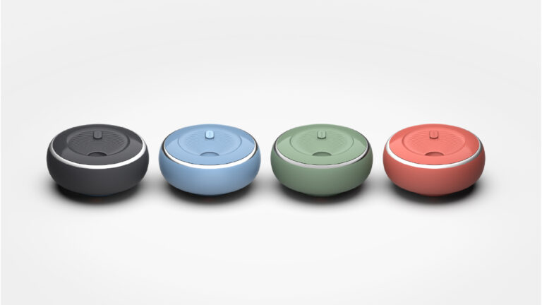
My Dabba
Redefining mealtime freedom through intelligent, sustainable design.